Interview with Brandon Stanciell

tumblr_nkurjhPmKX1qar339o2_1280

Brandon Stanciell photographs women and men, using nature as the main props. For Design & Culture by Ed‘s April issue, we’ve caught up with him – here is the interview you don’t want to miss!

tumblr_nkurjhPmKX1qar339o1_1280tumblr_nllpyejpBw1qar339o2_1280

You’re calling your self “The Man Who Loved Flowers”. Is there anything behind your enchanting title?

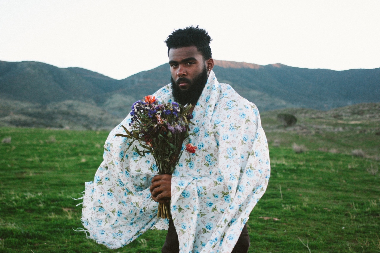
Maybe it’s not too enchanting, haha. The name is inspired by a short story by Stephen King titled, “The Man Who Loved Flowers” I like to believe that my camera is the hammer the uses and the women whom I shoot photos of are “Norma” it’s kind of weird. I also refer to the women as being the actual flowers in my work. I love flowers. Theres a more deeper meaning to it I guess.

tumblr_nlsue6mahk1qar339o4_1280tumblr_nlsue6mahk1qar339o3_1280When did you discover your visible love for flowers?

 I guess it’s have to be this day,(April 28th 2014 to be exact haha)
when I shot photos of Agne. That was the day It kinda all started. It kind of started on accident to be honest. We went to the poppy fields to take photos, it was so windy and cloudy we didn’t think they’d come out good. Got home, uploaded the photos to the computer and fell in love.

tumblr_njhn4hYNZJ1qar339o2_1280tumblr_njhn4hYNZJ1qar339o1_1280

What do you usually want to convey to the viewer of your photographs?

When viewers see my work I want them to see more than just a photo. I want them to look at every detail. Try to feel or smell the flowers. Not  just “a model with flowers”, but a painted portrait of flowers ya know.

tumblr_nlfcxa7xvh1qar339o3_1280tumblr_nlfcxa7xvh1qar339o2_1280tumblr_nlfcxa7xvh1qar339o1_1280

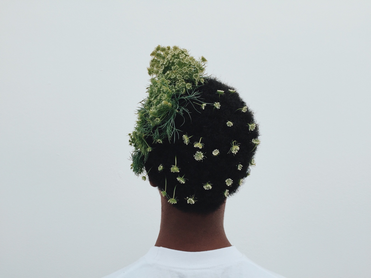
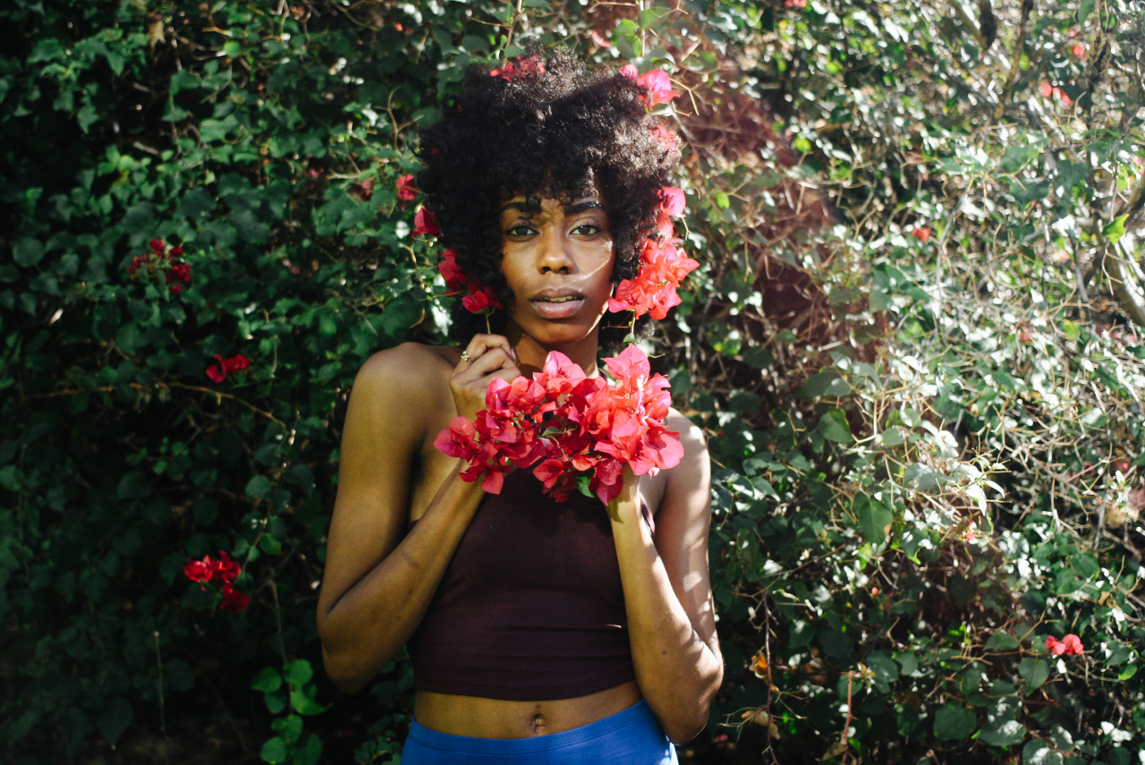
I discovered your work thanks to “Thinker of Exquisite Thoughts” on Instagram. This work tells us so much. How can you describe it?

– It’s the beginning of a new series I’ve been working on. Its a reference to Shel Silverstein’s “The Thinker Of Tender Thoughts”  , staying true to oneself when face to face with society. It’s also a self-presentation of how my thoughts/art work start off for the love of flowers “Thinker of Tender Thoughts” then grows into something more beautiful more interesting, as I start to understand the love of flowers “Thinker of Exquisite Thoughts”. SPOILER ALERT: There will be a part three, possible 4 so watch out for that…

tumblr_nlr2i8CNpi1qe9qsto2_1280tumblr_nlr2i8CNpi1qe9qsto1_1280

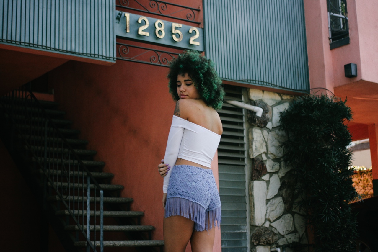
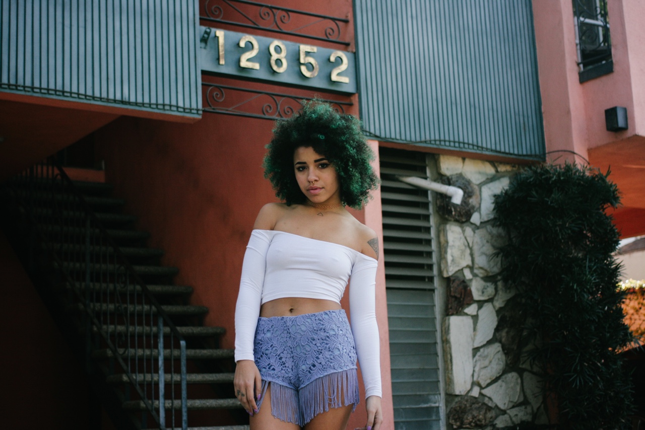
Your photographs are characterised with diverse, beautiful casting of models – is it also connected to your vision?

Yeah I’d like to think so. Most the “models” I work with are friends or coworkers (I use to work at American Apparel) people I see often, that have something about them I just couldn’t shake, so I had to photograph them. They’re all a huge help and I appreciate them for dealing with how weird I work, walking around in neighborhoods and shooting In someone’s front yard, shooting in front of apartment complexes. We do a lot of walking so it’s a workout too haha.

More on http://www.valleyhoodlum.us

tumblr_nllpyejpBw1qar339o1_1280

Interview with Tina Burgos

50037_02

For February, Tina Burgos is the person that inspires me. She’s the owner of Covet + Lou, a place and e-shop in Boston, where curated objects meet lables like Rodebjer and vintage Dries Van Noten. So, here is a very special interview for you…

How did the idea of Covet + Lou appeared?
I’ve always had a career in fashion. For 10 years I co-owned a small boutique, called Stel’s, in Boston. For various reasons, including the birth of my twins, we closed the shop.  Still desiring to own a retail shop while having more flexibility to spend time with my family I developed the concept for Covet + Lou.

40828_03

50042_01

What inspires you most while you choose and curate the items in your store?
Most of the buying decisions I make are based on my own personal aesthetic.  I am trying to maintain a carefully curated selection while expressing the Covet + Lou lifestyle.  Much of what I stock in the shop represents items I myself would wear and put in my home.

40267_02

50053-01

50069-01

Covet + Lou is supplied with very eponymous, silent labels – Kapital, Ace & Jig, Gabriela Atigas are just to name few. Was it hard to find these niche, but bold labels when you started?
I’ve always been a champion of independent, under-the-radar designers.  In many ways, this is the creative talent that keeps the fashion industry interesting and moving forward.  Over the years, Stel’s fostered and developed many of these collections.  So I relied on my past relationships to land these brands for Covet + Lou.

40719_02

40922_01

40586_01

I love your VINTAGE category – where do you find these treasures?
Even though it takes so much work, this is my favorite category!  It’s amazing to me what people deem as trash. I diligently hunt thrift stores, estate sales, antique malls and flea markets for my pieces.  There is a wealth of mid-century product in the Midwestern states and more traditional, colonial items in the New England area.  At some point in the near future I’d love to head to the Southwest and see what amazing things I can find there.

40602_01

40523_01

40785_03

What do you appreciate most in clothes you wear yourself?
There has to be the perfect balance of form and function in anything I wear.  My days are extremely hectic as I run the business and manage my family.  So in addition to wearing clothes that appeal to my sense of style, these items have to be versatile and comfortable enough to work in a variety of situations.

40264_02

40533_03

40835_01

50050-02

More on covetandlou.com

Inteview with Abigail Doan

tumblr_ngs6rifbCb1r0k6ypo1_r1_1280

In late January, I’ve met up with Abigail Doan (@lostinfiber) on Instagram – her moody, calm feed made me feel interested in her specific approach to art. As I learnt later, Abigail is an environmental artist and writer who divides her time between NYC, Eastern Europe, and Tuscany. Her work as a fiber artist offers a unique view into the materials, methods, and life cycle of handmade textiles, slow fashion garments, and related environmental issues. Doan’s most recent curatorial projects include Fete for the Senses as reviewed on Trendtablet, (Re)Fashioning Fiber in NYC, and Fashioning Self and the Environment at the Textile Arts Center in Brooklyn. And now, specially for Design & Culture by Ed, Abigail agreed for an interview… so here is our little collaboration!

tumblr_ng7vg2F0zA1r0k6ypo1_1280

How do you explain or describe your mood and approach to textiles and slow fashion garments?

I am first and foremost an artist expressing aesthetic ideas that share territory with art, design, fashion, and textile traditions. For this reason, I hesitate to categorize objects, as I am attracted to the material exchange between realms and the subtle details that are unexpectedly revealed. Slow for me is basically about cultivating a connection to place as well as an understanding of self in relation to the environment. Immersing ourselves in the art of slow fashion might allow for deeper connections, more efficient flow, as well as identification of softer tools for implementing change. Local wisdom is certainly part of this equation as well as increased sensitivity to the cultural experiences and conditions/talents of people’s globally. (here are her fashion inspirations from her tumblr)

nextek

Jalouse Magazine by Alice le Paige

Viktor & Rolf 1994

Viktor & Rolf installation 1994

The Row Resort 2015

The Row Resort 2015

In three words, describe your work.

Connective, place-based, tactile.

On your Tumblr called Lost in Fiber, you show a lot of beautiful, cozy handmade textiles and artifacts. What is the idea behind posting these images?

I keep several Tumblr archives as a way to demonstrate visually intuitive connections between objects, places, textures, textiles, and sculptural wearables. Lost in Fiber is a new skin on a previous project that explored ideas related to fashioning self and the environment. The site’s featured images are meant to spark the imagination while also archiving ideas relevant to ongoing research and collaborations with others. I often intersperse images of my own work and travels in order to illustrate an overall narrative of creative process and like-mindedness.

tumblr_nfxhshactL1r0k6ypo1_1280

tumblr_nhefutsZZX1qcc1ozo1_1280

While searching your site (and Instagram feed) I noticed not only NYC, but also places like Tuscany and Eastern Europe’s countries. What do they mean to you?

I have my principal studio in NYC but my family and I have ties to Bulgaria and Italy. I decided early on to try to live and work in these places so that my children would also cultivate connections and memories (nostalgia) for these landscapes and their unique histories. I recently returned to NYC after five years of living in Sofia growing a small family foundation that works to cultivate cultural outreach and educational efforts in Bulgaria. This was a tremendously valuable experience for me as it allowed me to further explore slow crafting methodologies in Eastern Europe as well as connecting with artists and designers in these regions who are (re)interpreting traditions and contemporary phenomena in eye-opening ways.

TheExpandedField03

tumblr_lphvfh5N8A1r0k6ypo1_1280

tumblr_mkr0e9kTqA1qcc1ozo1_1280

Last, but not the least, you have also another Tumblr called Thracian Threads and as I am Polish, I see a lot of Slavic inspirations behind it. Is it so?

Yes, it is true. Thracian Threads is a stash of images that I started collecting and documenting while living in Bulgaria and traveling to neighboring countries. I decided to focus on the idea of Thrace as a way to get back to some of the core traditions from the region and the rich history of these ancient crossroads, particularly in relation to costuming and the handmade. Thrācia in Latin is derived from thrāssō, meaning to trouble or stir in Ancient Greek. Let’s just say that I want to stir things up a bit – slowly, thoughtfully, and across our perceived time and space borders. This is what my currently project Lost in Fiber 2015 will be all about.

tumblr_mn9kymdojJ1ry4moxo1_1280
tumblr_naaoxneJ7u1ry4moxo1_1280

tumblr_mwitca1vik1ry4moxo1_1280

tumblr_n547zzFgE61ts8p6oo1_1280

Thank you Abigail  for this lovely interview. If you are interested in her art and want to immerse into her mood, check her sites:

abigaildoan.com
abigaildoan.tumblr.com
lostinfiber.tumblr.com
thracianthreads.tumblr.com
abigaildoan.blogspot.com

Interview with Reed Anderson

20140416-054144 PM.jpg

While seeking talented fashion designers and artists on the social platform, Instagram, I discovered Reed Anderson (@iamreed), who is creating unique artworks in Brooklyn, New York. His practice draws from a background of printmaking and cultural arts, creating an interesting mix of modern fantasies, making you imagine what you feel like. The heart of Reed’s current body of work uses large pieces of intricately cut paper as a stencil, which is folded and painted upon itself multiple times to create an image. Paper that has been cut out of these drawings are further embellished and collaged into the larger drawing, while smaller artworks arise from “detritus” printed elsewhere while working.
I hope you will enjoy this special interview with Reed that is only available here, on Design & Culture by Ed!

20140416-054101 PM.jpg

ED How would you describe your artistic techniques? They look really unique…

REED Thank you… I think primarily my work comes out of printmaking and painting… The cut paper works are hand-cut into large painted and printed stencils that become the tools that effect other work, but they also become works unto themselves. Pieces that have been cut out of the paper reappear as collage as things are patched and disorganized …reorganized. This time-consuming cutting of paper is countered by a more irreverent way of working with it once this process is complete …I like countering the super intricate with the fucked up messy things, it’s more true to life.

ED What is the “Papa Object” all about?

REED These paintings steal auction catalogue images and reproduces them as large photographic images that are printed on, painted, cut, collaged, altered and walked on to re-present the object as a kind of painting. PapaObject is specific to a group of these paintings I mailed to locations around the globe as a kind of research experiment before deciding to show them publicly. Places included a sweatshop in China, a research vessel in Antarctica and an office cubical at MOMA. (can we get Poland with you?) The project can be seen at http://www.papaobject.com. I am currently looking for someone to help publish this as a book.

20140416-054239 PM.jpg
ED I heard you have a solo exhibition at Pierogi Gallery in New York. How did you feel when you were offered this surely mind-blowing experience?

REED I always feel grateful to be showing my work anywhere …but yes, opportunities to show in New York are especially “mind-blowing” as you say, because of the scale of audience that you reach. This will be my fourth show at Pierogi, and I feel very lucky to have them representing me here in New York.

20140416-054357 PM.jpg

ED What is behind “The Way You Look is The Way I Feel” title that is the name of your Pierogi exhibition?

REED Titles are important to me, but less so about specifics and more about an energy they give …also important is how they feel in the mouth, when you say them. This particular exhibition title came from something someone said. I knew immediately I had to take it. The more I thought about it, talked to people… it became clear how many different ways we could see it. Was it a pick-up line at a bar or was it about people looking at art or each other? It’s really funny to me, but there’s always something serious when we’re laughing.

ED While working, do you plan before creating or you do it spontaneously?

REED If you want to take a trip, you’re just a tourist if you carry a map. The work embodies some of the processes of printmaking, a kind of plan, but later this map is always tossed out for the forward spontaneity of painting. I would get bored if I always knew where I was going…

20140416-054512 PM.jpg

ED Do you have any motto you would like to share with DACBE’s readers?

REED This Buddhist monk and I were talking about worry (…this sounds like I’m telling a joke) and he said to me, “don’t live in the ruins of your future” … I think about this any time I’m starting to get freaked out about stuff. It keeps me in the present and allows for an optimistic blind faith that is necessary to continue working.

Reed Anderson’s show at Pierogi Gallery runs through April 27th. The gallery is located at 177 N. 9th. Street, in Williamsburg, Brooklyn, New York City www.reedanderson.info

20140416-054849 PM.jpg

Interview with Helen Bullock

20131113-081242 PM.jpg


Helen Bullock (Central Saint Martins BA, MA) is a textiles-driven label, using strong silhouettes as a platform for bold prints of a visceral nature. Throughout the seasons, work has been featured in publications including Dazed & Confused, i-D, and Vogue. And… now she’s up on Design & Culture by Ed !

EDWARD: Hi Helen. You are a young fashion designer from London, who graduated Central Saint Martins BA and MA, having your own label Helen Bullock and doing amazing illustrations during the fashion weeks. It’s all really impressive. Well, I hope you are doing fine?

HELEN: I AM!!!!

ED: What inspired you for this season’s collection? It’s so FULL of prints! And as I know, all textiles are designed by you.

H: Yes! All about the prints! As always a look across many different paths of imagery in an attempt to create my own visual story. At first I was driven by the bold honesty of graphic 60s prints, alongside a carefree image of Peggy Moffitt, combined with the intensity and composition of Keith Herrings work. Bit of a whirlwind really.


20131113-081709 PM.jpg


ED: Many designers usually find out they are going to be in fashion industry after sometime of studying different stuff. But when you were choosing your college, did you feel from the beginning you will be a fashion designer?

H: As the cliche often goes it really was something I dreamed of as a kid – but no more so perhaps than other options that preoccupied me. I eventually started studying fashion a little later than normal, and was a little resistant as thought the fashion pathway was a little predictable, and was thinking of myself as a fine artist. That all stopped though when I came across the idea of print … something that I’d never considered before, but seemed to bridge the gap so well between art and faaaashion!

ED: If you could choose, who would you love to wear your pieces? This can be an alive or dead person…

H: Well … I absolutely love it when Julie (Vehoeven) wears them …. but on a wish list Peggy Moffit would be super … and Iris Von Apfel would surely rock it!

ED: Who is your biggest fashion idol?

H: Anyone really who is prepared to take a risk and walk down the street holding their head high. I’m sat next to a lady Linda right now wearing a wonderful explosion of a Diana Freis dress…and dolly curls in her hair – we work together every Monday, and she never fails to impress.


20131113-082108 PM.jpg


ED: While you are a fashion designer, at the same time you’re contributing your fashion illustrations for A Magazine Curated By…. How would describe your drawing style?

H: Intuitive, sparing and in equal measures intense, at times awkward.

ED: Looking at your print erupting clothes, it seems you have a very energetic personality. Does your everyday style reflect the collections?

H: I hope so. I feel at a low if I’m not wearing brightness.

ED: If it’s not a secret- what are your next future steps for your label?

H: I’m trying to work my label as a limited edition made to order product. So rather than stockists, I’m almost searching for a place to exhibit the garment. At present though I’m setting up an on line shop, and have various collaborations in the pipeline.
I’m also hoping to add a range of scarfs to my next collection.


20131113-082502 PM.jpg