Take a Bow. Jonathan Saunders SS15

_AG17485

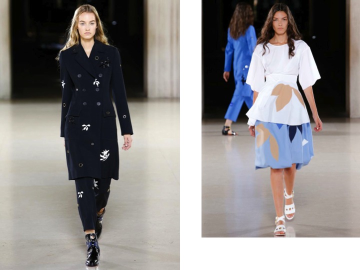
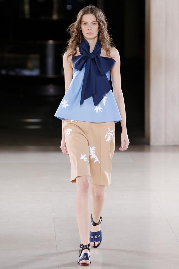
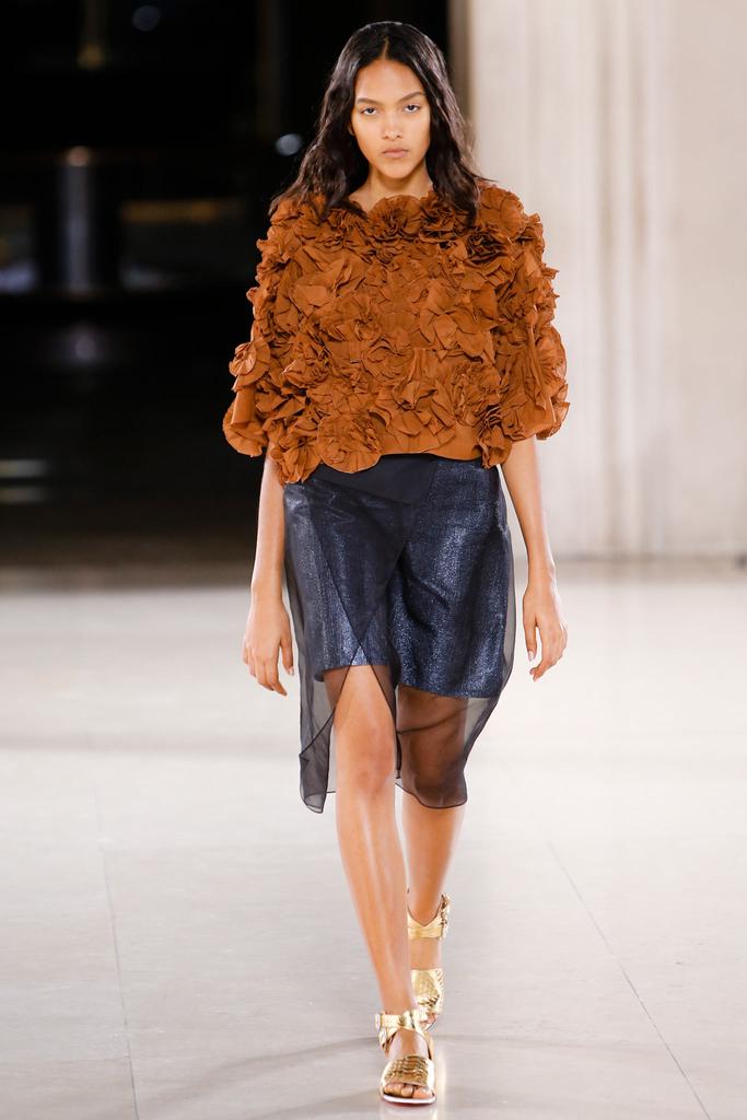
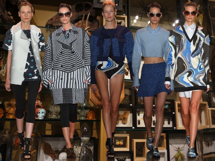
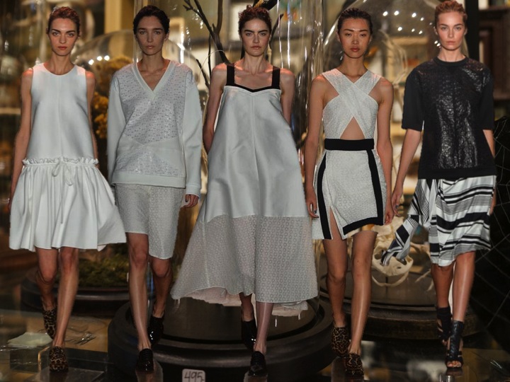
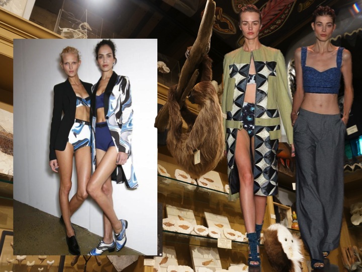
I like that, Jonathan! This season is possibly the most strong to date for this British designer. In his files, he’d come across a piece of cotton voile from a Japanese mill as light—and pliable—as paper. The possibility of combining the two inspired a striking effect: paper saturated with blue, impressed on fabric, like artisanal color-blocking. “It’s about process,” master printmaker Saunders explained. He wanted lightness. He got it.The show was really about beautiful lightness, ruffles and ribbons. This fragile yet very dynamic collection had also a beautiful shade of blue in it at the end. It felt elusive and fresh. And, in comparison with last season, it was much better!

Slide2

_AG17499

Slide3

_AG17700

Slide4

Cool Girls. Peter Som SS14

Slide1-kopiaThe second day of fashion week in New York is all about Summer glamour, lightness and bright prints- but not as last summer, where we could see only stripes. No it’s all about a la Emilio Pucci prints that look super sexy on the swimsuits. The Peter Som collection for SS14 was definetely one of these cool shows. The blue colours looked refreshing, just like the geometric lines and white, over large dresses! The collection was a bit about the style of mixing prints and trends- it was a pleaure to see these vintage looking shoes in leo dots mashed up into the look of the beautiful balloon white dress. This young designer’s leather speciality is for sure the eel skin- this pretty specific fabric was used to cover whole coat that looked marvellous! But, I can’t hide my impression, that Peter certainly did copy some details from past collections of his New York “in the proffesion” friends…Slide3Slide4Slide2Slide5