“The Basilica di Santa Maria del Fiore (English: Basilica of Saint Mary of the Flower) is the main church of Florence, Italy. Il Duomo di Firenze, as it is ordinarily called, was begun in 1296 in the Gothic style to the design of Arnolfo di Cambio and completed structurally in 1436 with the dome engineered by Filippo Brunelleschi. The exterior of the basilica is faced with polychrome marble panels in various shades of green and pink bordered by white and has an elaborate 19th-century Gothic Revival façade by Emilio De Fabris.” In other words, that place is wonderful and very emotional! The ornaments, forms… I love it! And what’s more it’s super inspiring!
Ornaments
Church Anglicans. McQueen AW13

There were only ten looks from whole collection that can be forgived because Sara Burton has new twins! Congratulations! And why forgive? Because the collection was so beautiful and really haute couture, and I would love it longer. It was a continuation of Pre-Fall collection that was full of church inspirations. This time Burton divided the ten into five subgroups: Communion, nuns, cardinals, popes, and angels. In a scarcely believable but timely twist for McQueen, Britain’s most senior Catholic cardinal has just stepped down in the wake of one of those sex scandals that endlessly plague the Vatican in the twilight of its domain.
The dresses were so amazing! Lots of embroidery, silk, pearls, gold, ornaments… Ah, so baroque and opulent! It was luxurious but not RTW! That’s for sure. But I love it so much. And the interior of runway? An old palace with lots of decorations and rich lamps!

Turkey Express. Kenzo AW13
Kenzo was a real trip to Asia. But to the modern one, west one. There were lots of Turkish and Indian influenced prints, colours like gold, red, and really great materials! At the beginning I thought that the designers were inspired with Proenza Schouler last seasons collection. But then it got even better and better! And I am happy because the designers are getting even more mature! No more jungle prints, tigers that I still love , but more rich and stylish! Love it!

The ultimate print of the collection was a turkish eye! It’s a symbol of happiness and luck. The jackets and pants were totally printed in it. There was also a Jacard thems- whole outfits made of jacquard material with beautiful prints. I really loved the blue colour on shirling coats. And the last dress in Indian patterns in gold shades that was covered in foil was a real essential! Lovely collection!!!
Kitsch Vs. Neutral
There is a new fight between two trends in Paris! Simple or Kitsch? Strong colours or beige and creme? Flowers, jewels, some kind of LOVE signs or shirling and leather? In this post I will cover four collections- Lanvin and Balmain that are classified as kitsch and Rick Owens and Nina Ricci as neutral and simple. So lets start maybe with something calm for eye, Nina Ricci. Katia and Marielle Labèque performed “Two Movements for Two Pianos” by Philip Glass on side by side grand pianos in the middle of a huge runway covered with old red carpets, giving a romantic feeling. Indeed, the collection was as romantic as the music that these two artists produced!The collection was a bit sporty but still very elegant. Everything was kept in simple colours hat are still eye caching- red, white, beige and black! My favourite look was for sure the dress with a bustier with mink fur on the top that gave a slightly different look!
Now it’s the time for other collection are pretty liked, and was very simple in lines and cuts, Rick Owens. These hilarious hairstyles the models had were so great! I think that Owens is always winning with other designers, with we are taliking about hairstyles. Rick used a lot of creme and white shirling fur on jackets and coats. There were some minimalistic column like silk dresses, ruffles on tops, leather gloves. But it wasn’t, you know, much of it. Rick Owens showed this season a sensitive beauty of ready-to-weat clothes!
And now it’s the time for kitsch in Paris. I think, Alber Elbaz was sick at the moment of designing the collection. Everything was so not matching. Without a form. A fail! Why did the Lanvin designer, put these horrible necklaces with hearts and pearls with a horrible signs like “YOU” or “LOVE” or something else? How is it possible to spoil a nice long silk beige dress with some kind of a furry scarf and jewellry that looked like from a petrol station? Why? It wasn’t even luxury. It was passe. Sorry Alber Elbaz, but that was a very poor collection. P.S. What the hell did these bugs were doing on a ruffled top?
(This post is going to end soon :D) Balmain with Olivier Rousteing did a good job. Let’s say it straight- Balmain can’t be easy and minimalistic. It should be always luxury, ornamental and kitsch! This time Olivier chose new colours like emerals, red and violet. Most of clothes were velvet and had a really decorated details. I really liked all the structured tops and skirts. I liked the green suede jacket that M. Frackowiak wore. And the big belts were really eye catching! It was altogether sexy and sophisticated, just as it should be at Balmain! I’m clapping!
So after these four collections I should say that I loved Nina Ricci and Balmain. Rick Owens was good, but a bit classy (for Rick of course) and Lanvin was horrible… So there is 2-2 for both of these categories! As we know from New York, Milan and london, luxury and ornamental clothing is back for good, but a little bit of minimalism is always the best!
Pop It. Tom Ford AW13

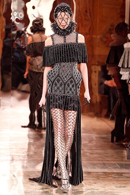
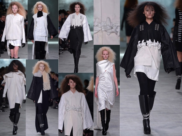
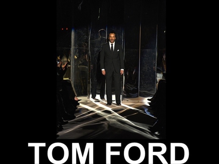
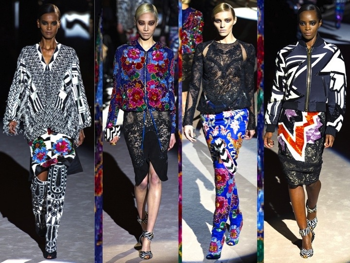
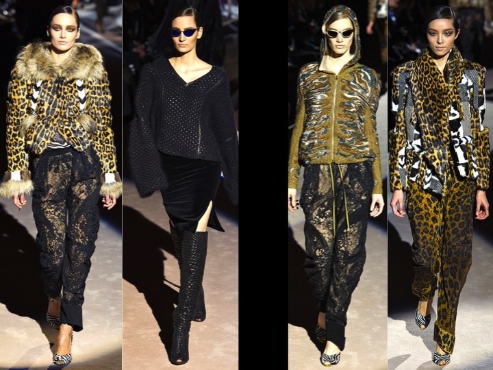
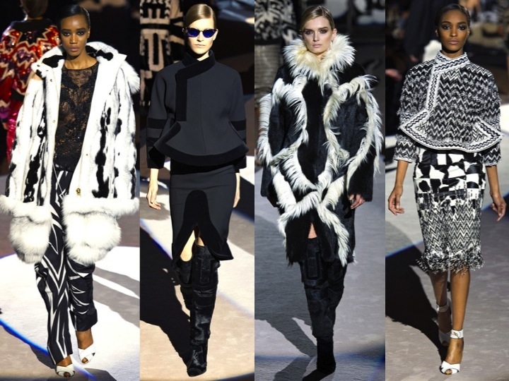
Tom Ford, that is now having a rebirth of his label that was for time being making cosmetics, and really long time ago was creative director of Gucci, is debuting with his third collection on London Fashion Week. Now I’m saying this. He is my favorite of the week. His collections are for real, they’ve got fur in great amounts (sorry PETA and eco fans), luxury embroinment on skirts and pants with Chinatown inspired flowers from the elegant lounges and clubs for elite. After a serie of super luxury sportwear with animal print a bit of black minimalism came on amazing sweaters.

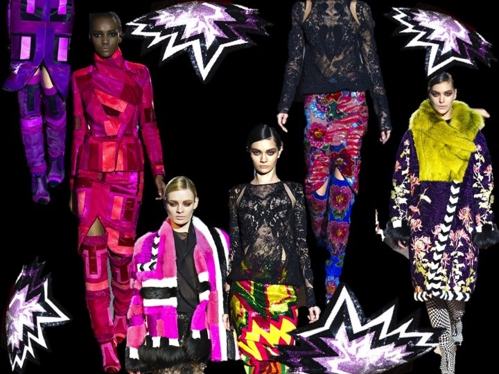
Ford was also inspired with Neons/pop art. Just look at the dresses and jackets! These Kapow patterns that are known from Roy Lichtenstein art are mind blowing. And what’s very Tom, is that he didn’t put these Kapow’s everywhere- no he used it in subtel, delicate amount, mostly on maxi gowns.

When the furs came around I thought to myself “Altuzarra and Prabal Gurung, take notes or run away”! The long, higly tailored coats with laser cut leather and white fur were breath taking! I was jst stunned.

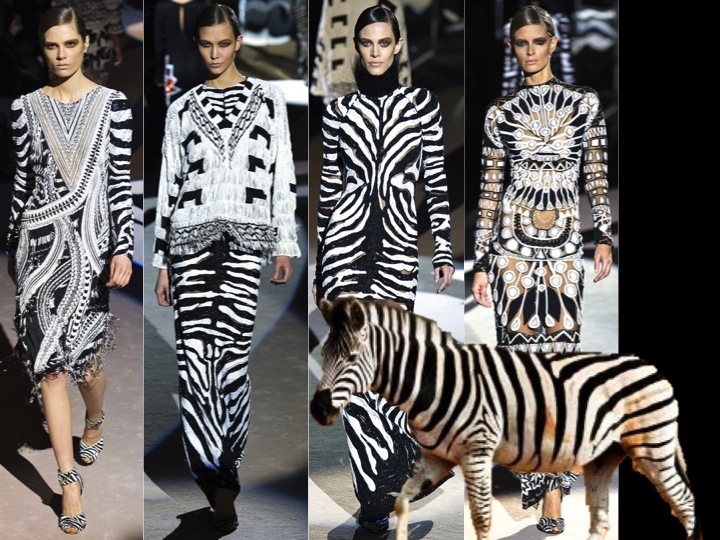
And the funniest part of the show was when the “zebras” came! The long evening gowns with sequined stripes in black and white were so classical but modern! Really the collection left me in many points totally stunned. And I was feeling, like if the models came out from a elite and luxury lounge somewhere in London, decorated in Chinese like ornaments and 60’s- 70’s prints… Tom Ford collection was BEST from whole London Fashion Week!


