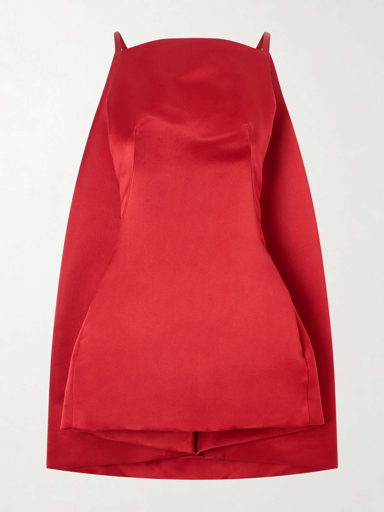
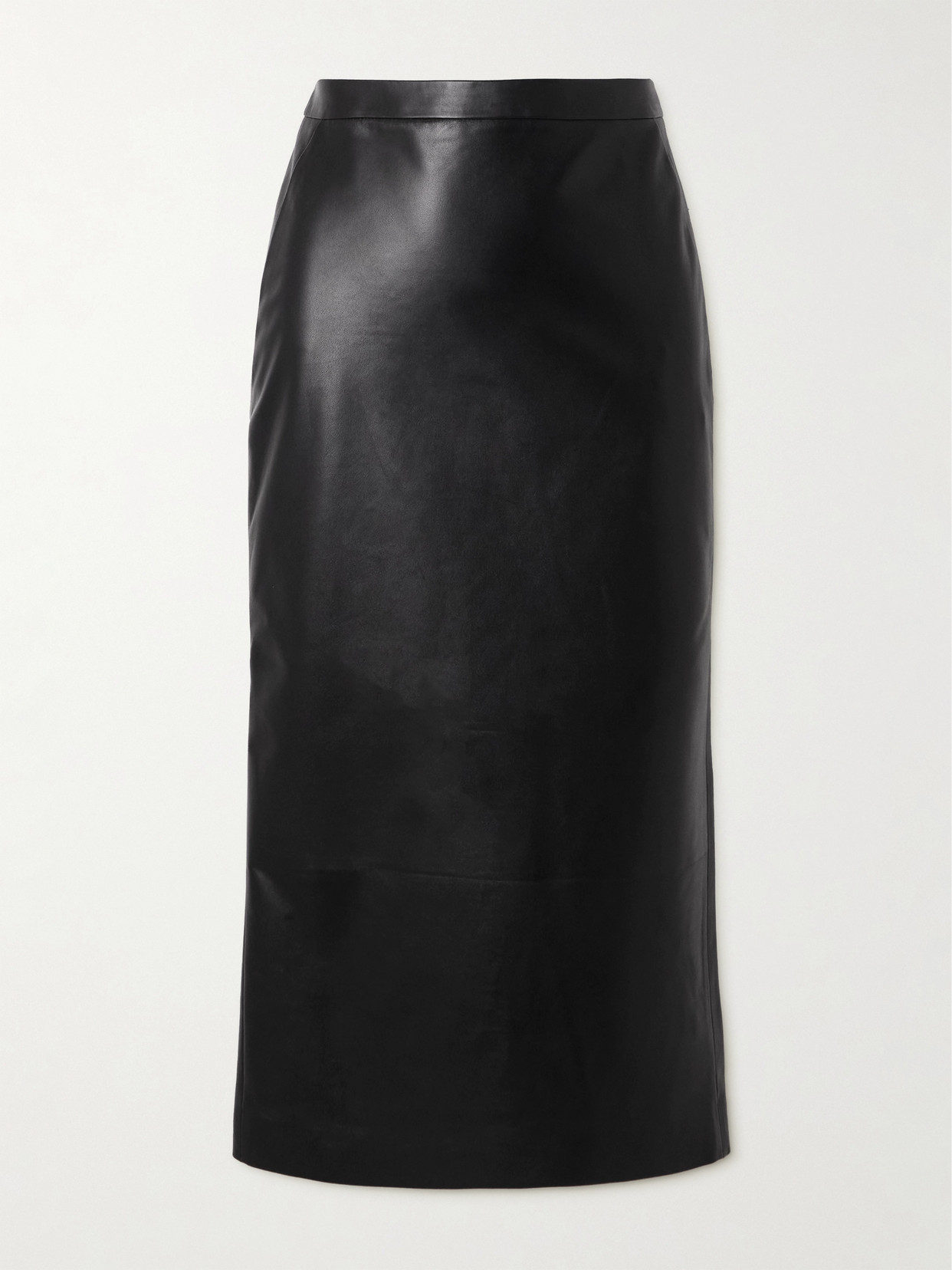
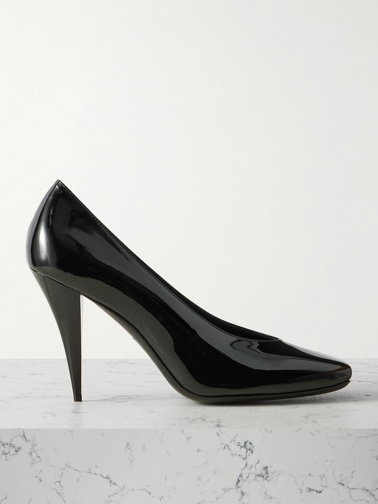
There’s a sense of familiarity, reality, and lightness to what Julian Klausner is doing at Dries Van Noten. A devoted student of Papa Dries, he makes the house’s blend of meticulous embroidery and erotically charged, slightly off-kilter – yet never overly weird – elegance feel completely instinctive, almost on auto-pilot. And that’s very much to his advantage: his work should feel like coming home for Dries devotees. READ MY FULL REVIEW HERE.
There’s a sense of undone-ness to Jonathan Anderson’s menswear method for Dior that I really like, even if it occasionally makes his vision for the house seem a little erratic. The image of an aristocratic kid in a pyjama suit and torn denim, stumbling back to his inherited château after a long, very fun night, ripping the wire out of a speaker and plugging his phone into it (very Rianne Van Rompaey opening the Louis Vuitton show in Palm Springs… a niche reference, I know) just to keep the party going, is strangely appealing. READ MY FULL REVIEW HERE.
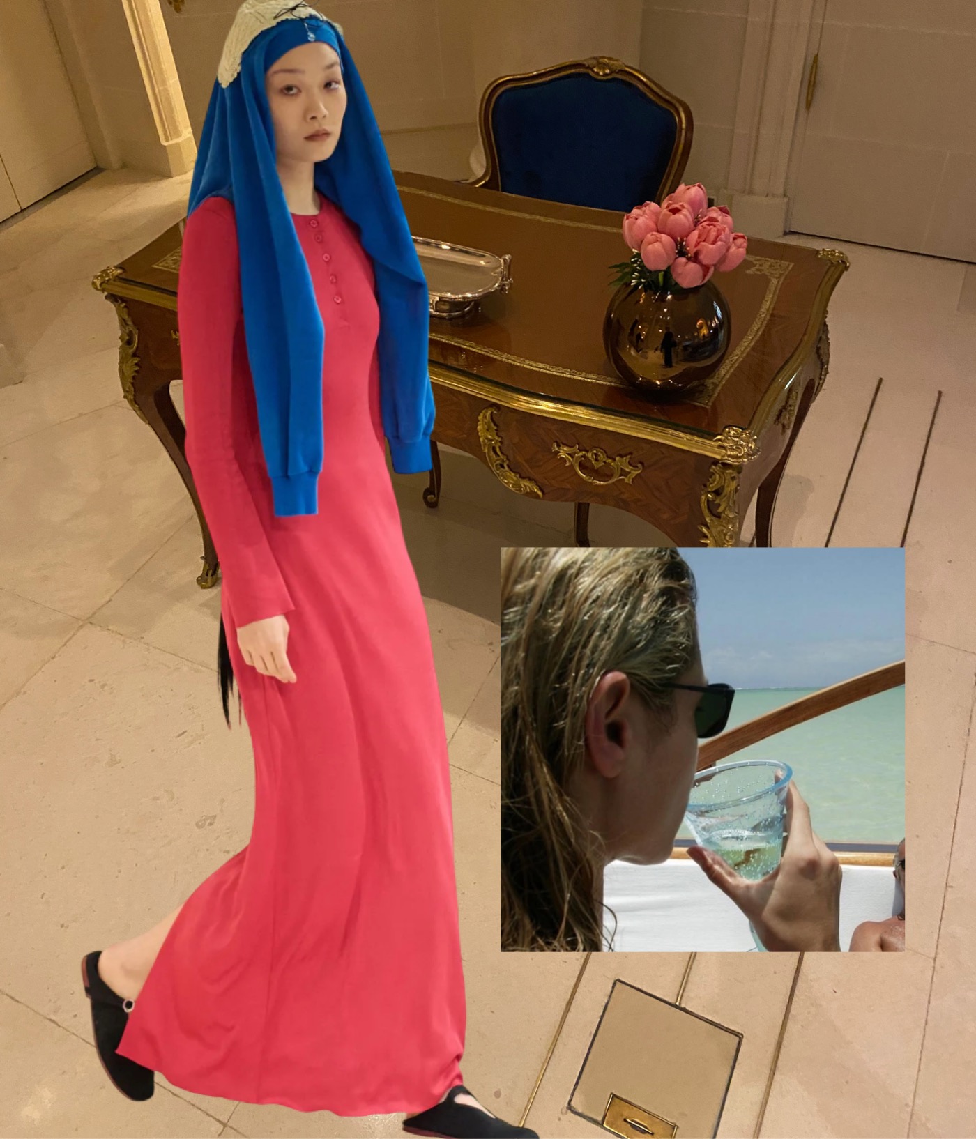
Collage by Edward Kanarecki. Don’t forget to follow Design & Culture by Ed on Instagram.
Hey, did you know about my newsletter – Ed’s Dispatch? Click here to subscribe.
Anthony Vaccarello’s Saint Laurent menswear collection seemed to have it all: a perfectly orchestrated front row amid a Paris heatwave, a new kinky shoe with an elongated toe and transparent construction, and a Fujiko Nakaya water-vapor installation as the show’s backdrop. Yet the clothes themselves felt inflated – not with substance, but with artifice.
It increasingly feels as though Vaccarello is repeating the same tropes: exaggerated shoulders on virtually everything, nylon-like windbreakers paired with tailored trousers, and trench coats rendered stuffy for no discernible reason. The flashes of eroticism are there, certainly, but they can’t speak for themselves; they get choked – though not in a sexy way – by relentless overediting.
I remember reading a few years ago that Vaccarello fantasized about doing an all-gold collection but couldn’t find a way to make it look chic. Well, he still hasn’t. The three final looks in slightly antiqued gold fabric failed to make much of an impact. Perhaps too much gold is inevitably tacky after all.
Collage by Edward Kanarecki. Don’t forget to follow Design & Culture by Ed on Instagram.
Hey, did you know about my newsletter – Ed’s Dispatch? Click here to subscribe.
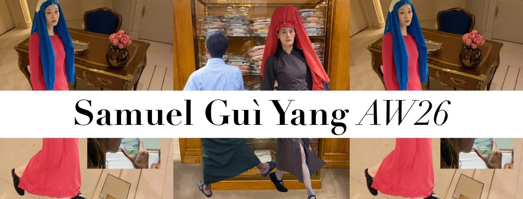
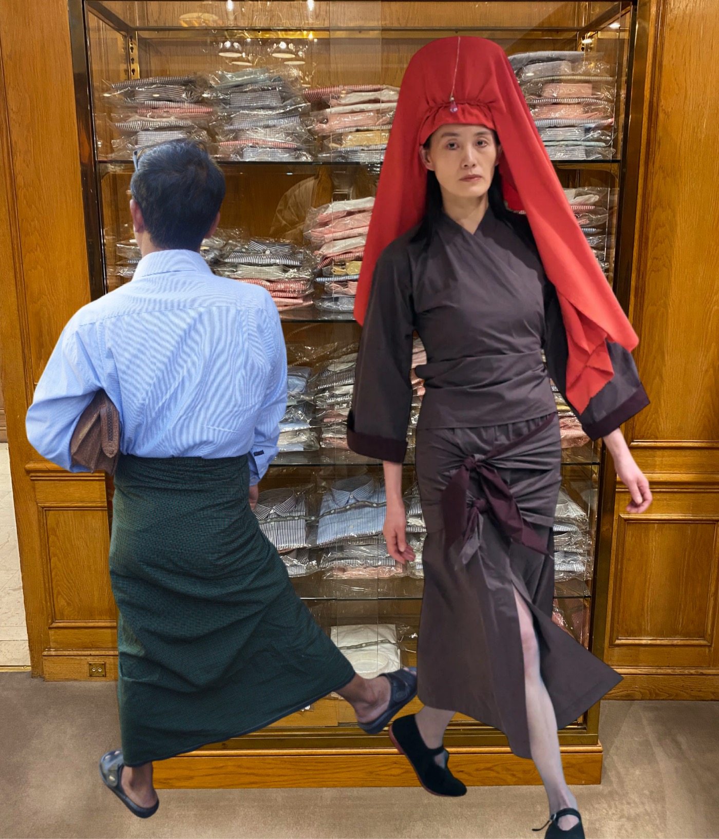
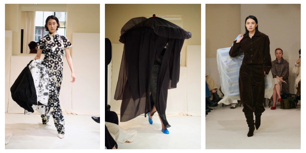
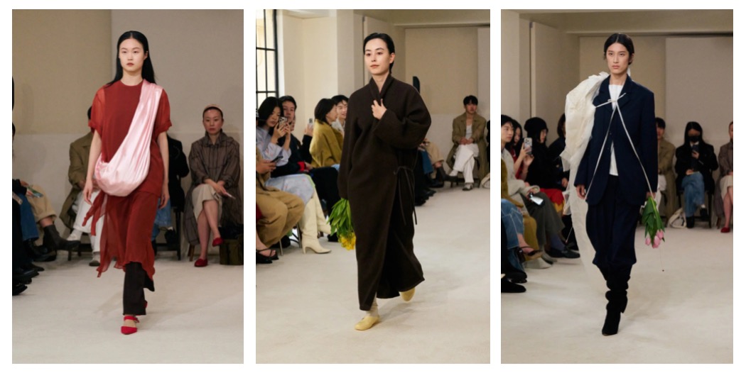
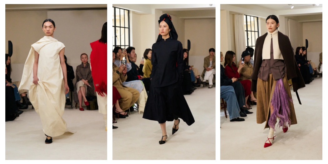
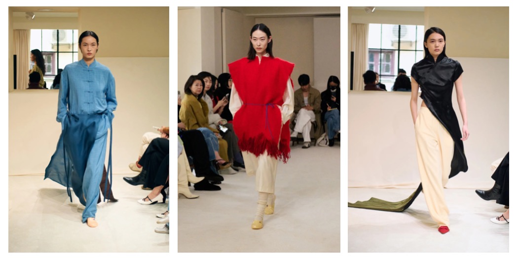
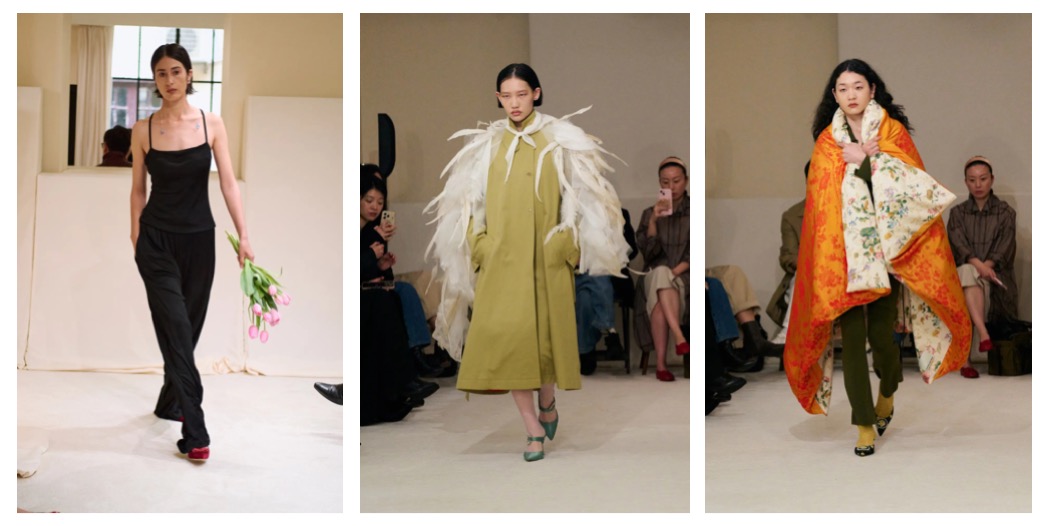
Shanghai Fashion Week is an increasingly important player on the global stage, and the clearest proof of this is the guest show by Maison Margiela. Yet the true highlight of the week is Samuel Guì Yang, a brand I have followed for quite some time and one that has become a genuine magnet drawing audiences to Shanghai. Among all the labels presenting their work, the collaboration between Samuel Guì Yang and Erik Litzen feels the most authentic – and, crucially, not derivative of their Parisian or Lodnon counterparts. The label possesses a distinct aesthetic that cannot be found elsewhere.
As the designers themselves explain, what is often referred to as “Chinese style” encompasses an expansive and complex world: it resists simplification, as it draws equally from history and contemporary life – from the rhythms of the street to color, humor, and everyday experience. This multiplicity informs their refusal to confine themselves to a singular cultural framework; instead, they embrace lighthearted fluidity.
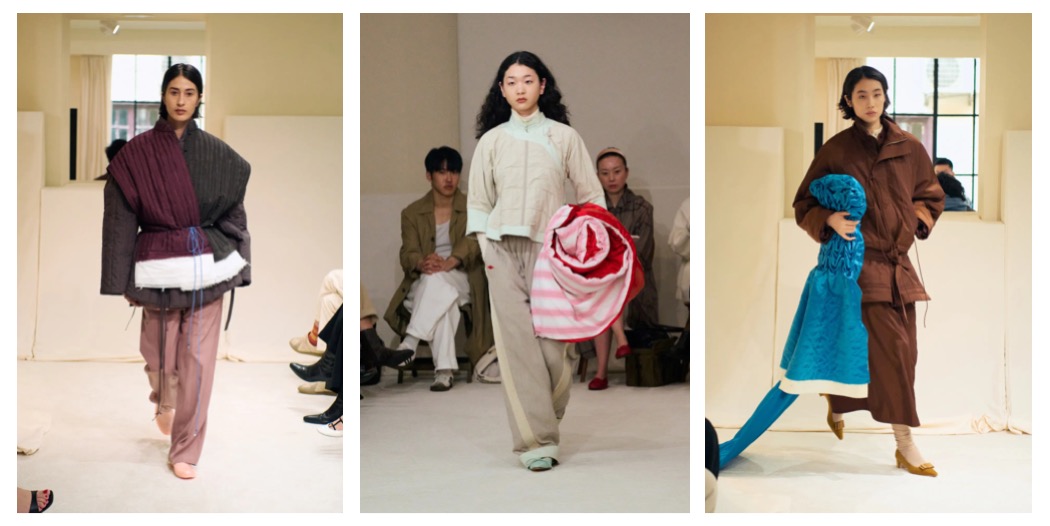
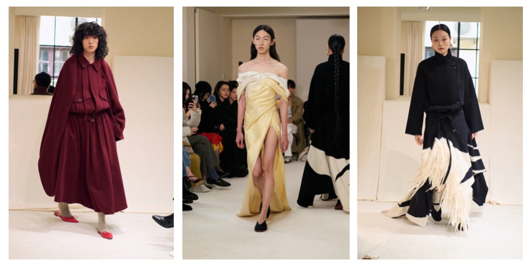
At a time when fashion is increasingly returning to a mode of freely drawing inspiration from global cultures – as seen, for instance, in the autumn–winter 2026 collections of Louis Vuitton and Loro Piana – Samuel Guì Yang stands at the forefront with its nuanced (and very chic) exploration of cultural provenance. A double-faced silk qipao, for example, was cut to fall from the body at the right hip before winding down to the floor like an evening gown. Elsewhere, a fringed poncho was tied with a piece of blue string, achieving a sense of harmonious ruralism. Additional elements – a striking feathered cloaklet layered over a raincoat, headpieces seemingly constructed from repurposed garments, and a square parasol with a trailing black canopy that nearly obscured the entire look – introduced a subtly folkloric dimension without referencing any single tradition directly.
As Litzen notes, his and Samuel’s process begins intuitively, followed by careful refinement to ensure that the results remain respectful and avoid coming too close to specific cultural boundaries. This balance between instinct and critical editing ultimately defines the unique strength of their joint effort.
Collage by Edward Kanarecki. Don’t forget to follow Design & Culture by Ed on Instagram.
Hey, did you know about my newsletter – Ed’s Dispatch? Click here to subscribe.
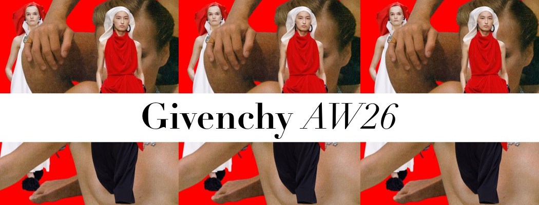
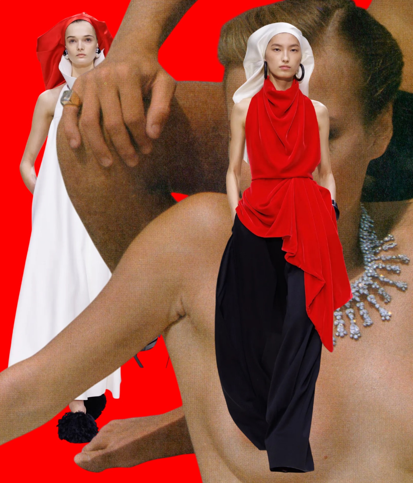
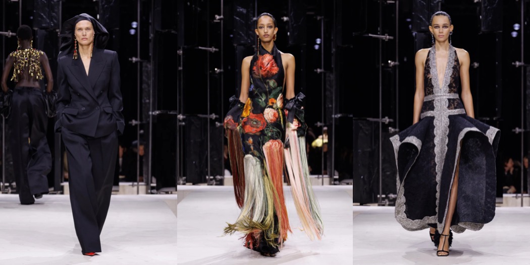
Ending fashion month on a show I’m still on the fence about – but one that clearly signals a designer stepping outside her comfort zone: Sarah Burton’s Givenchy.
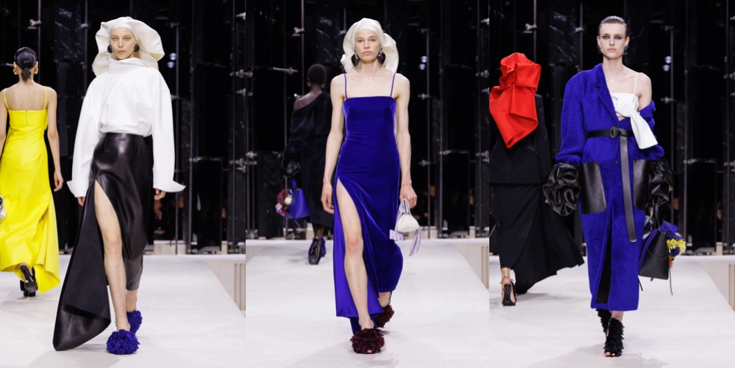
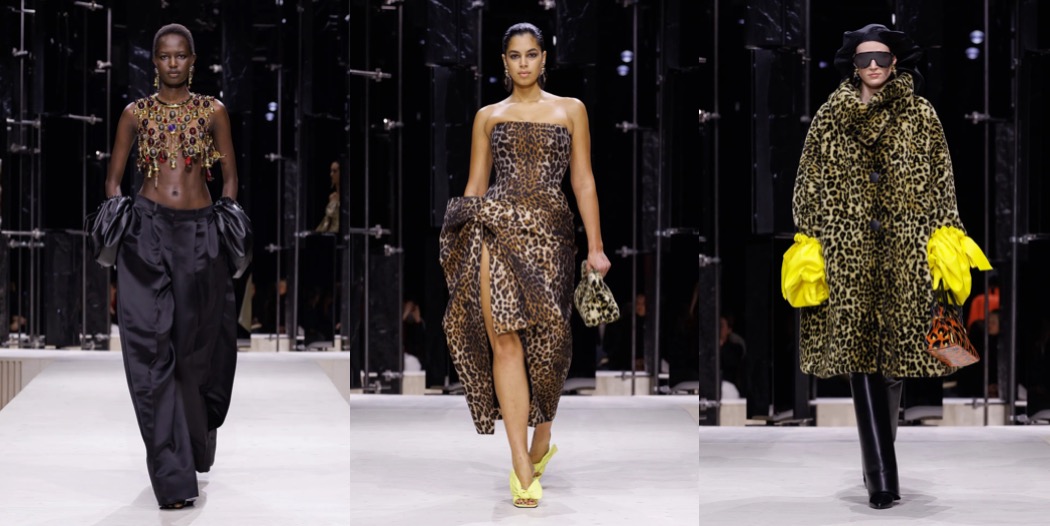
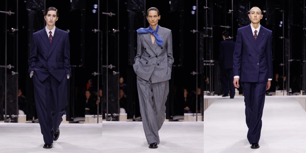
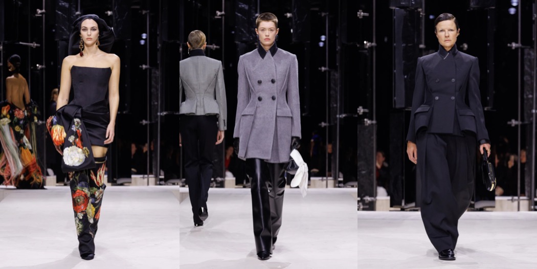
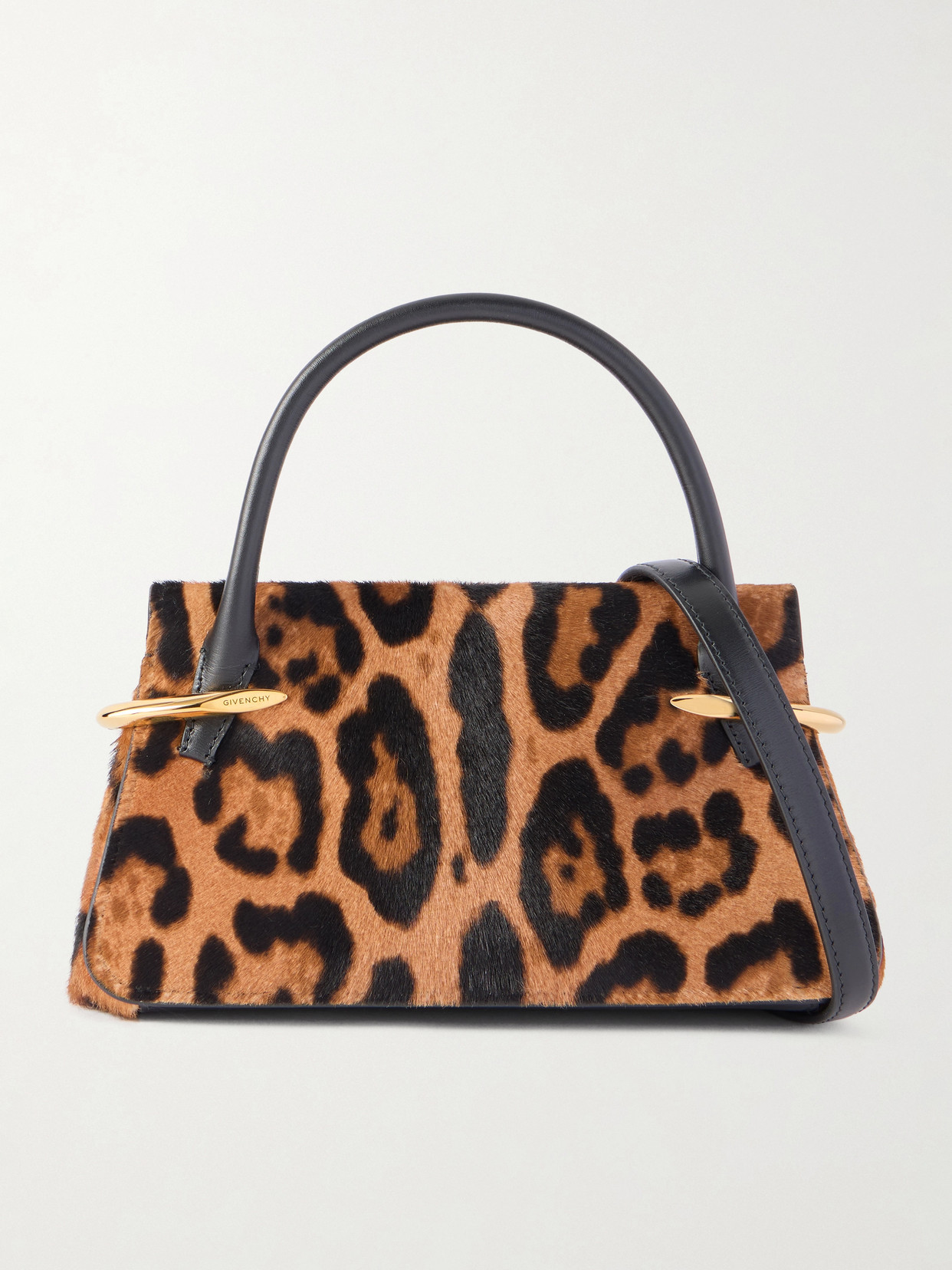
The good news is that Burton has shed what I like to call the “Taylor Swift–ness” that weighed down her earlier work for the house – a certain safety and plainness that defined her first two seasons. Her third outing is anything but bland; this is no longer boring chicken with boring rice. There’s spice here, and bravado – plenty of both. I was especially taken with the draped, turban-like hats, as if lifted straight from a Jan van Eyck portrait, created in collaboration with Stephen Jones. They paired beautifully with Burton’s richly draped velvet halter tops and sharply tailored trousers. Her use of leopard prints and textured jacquards clashing with butch-leaning tailoring feels unexpectedly compelling. At times, I found myself thinking of that “Sex and the City” episode where Charlotte York discovers the world of art-world lesbians – there’s a similarly unapologetic feminine energy running through Burton’s work. It manifests in both boxy suiting and off-the-shoulder party dresses, creating a dynamic tension.
What made the collection slightly less legible, however, were the clunky bags and heavy boots that seemed to weigh the looks down. A stylist with a lighter touch might help Burton sharpen her message. Still, something is clearly shifting at Givenchy. And I suspect we’ll see the most coherent vision emerge in a season or two, once Burton has fully settled into her role.