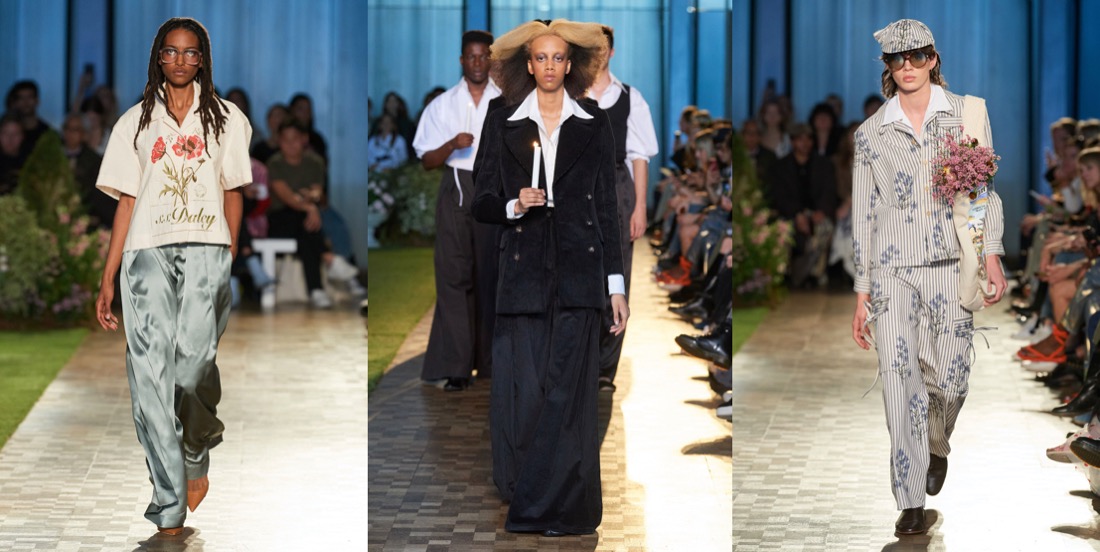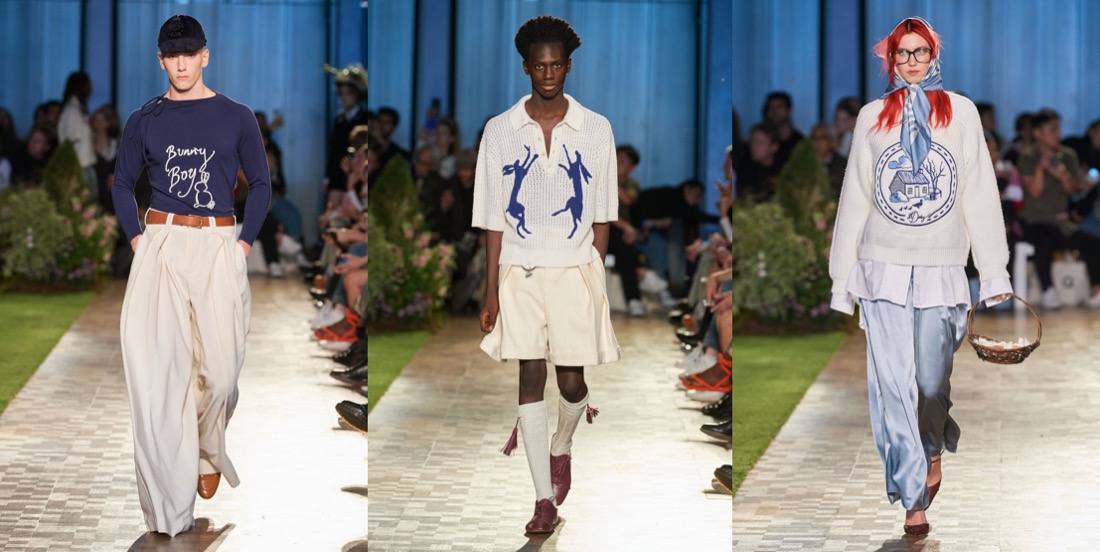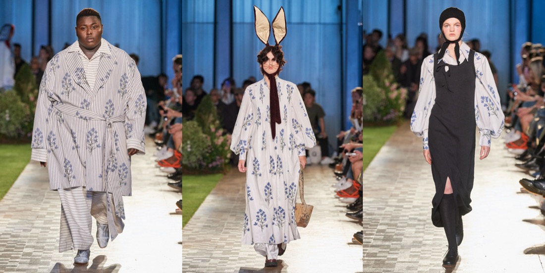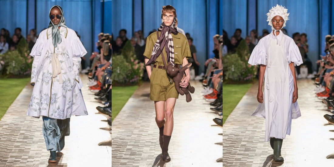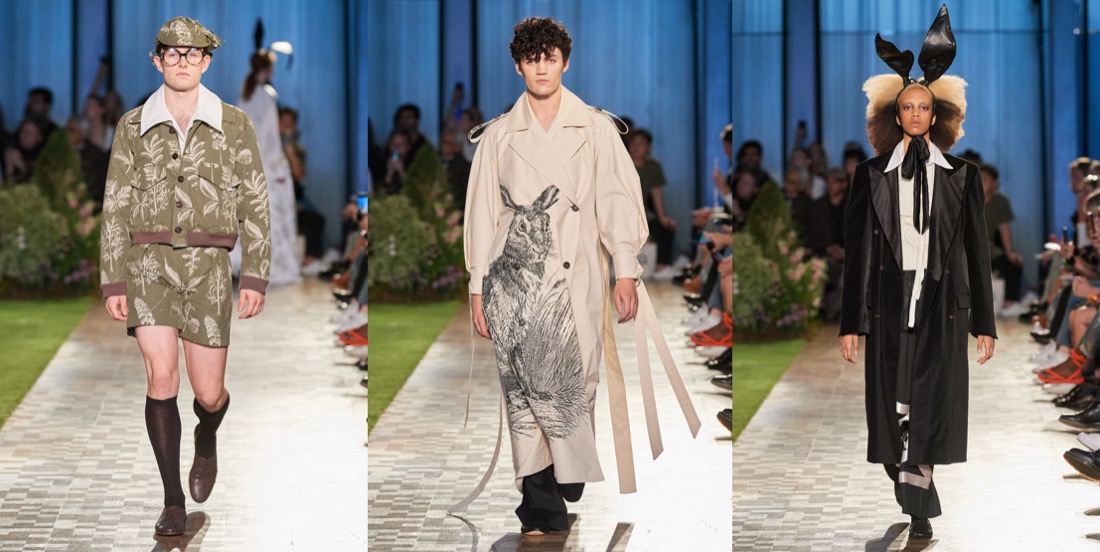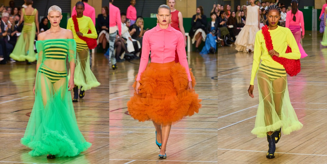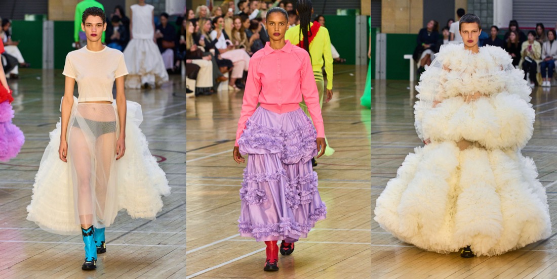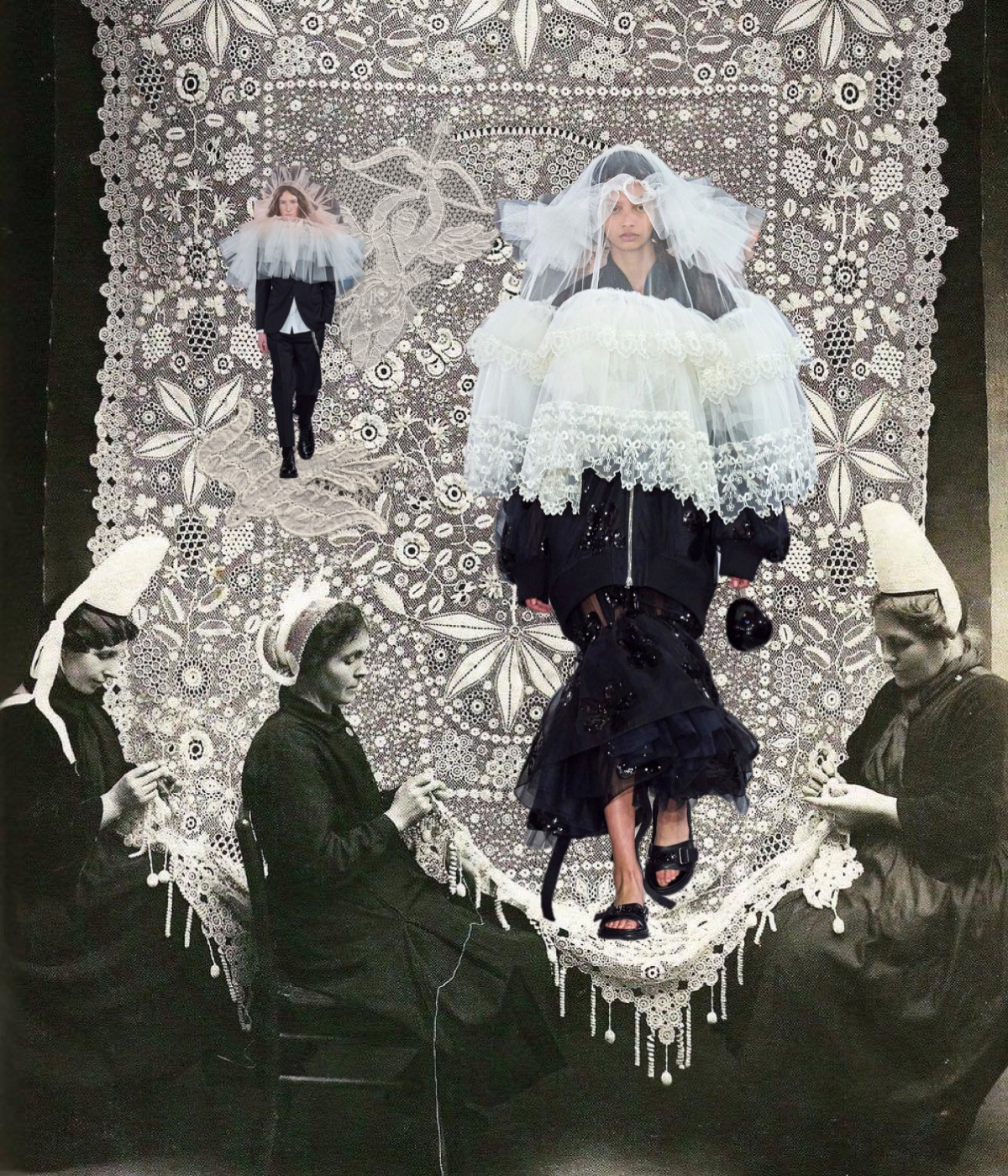
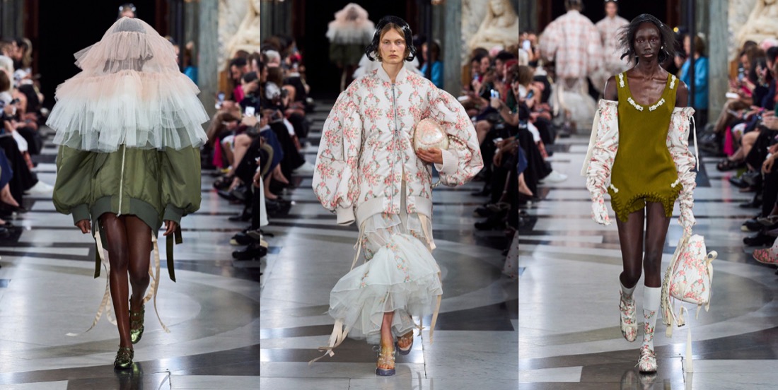
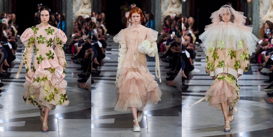
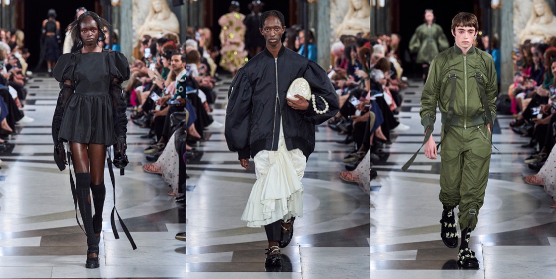
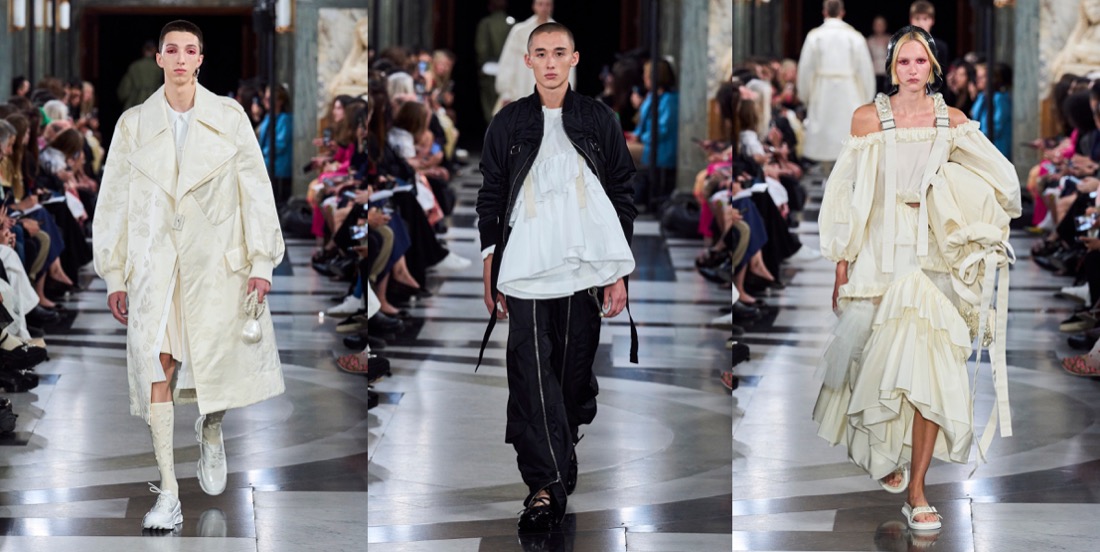
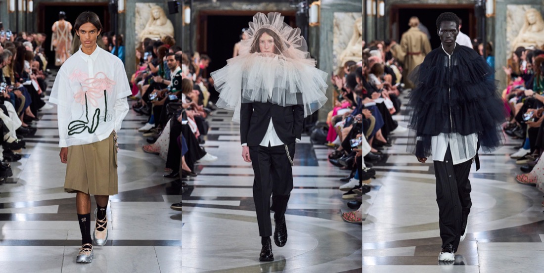
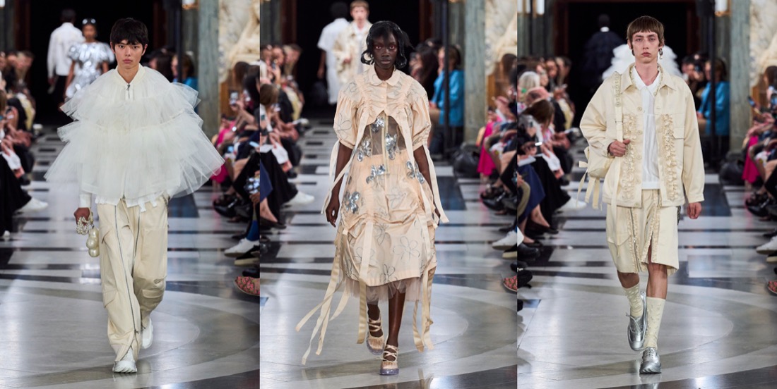
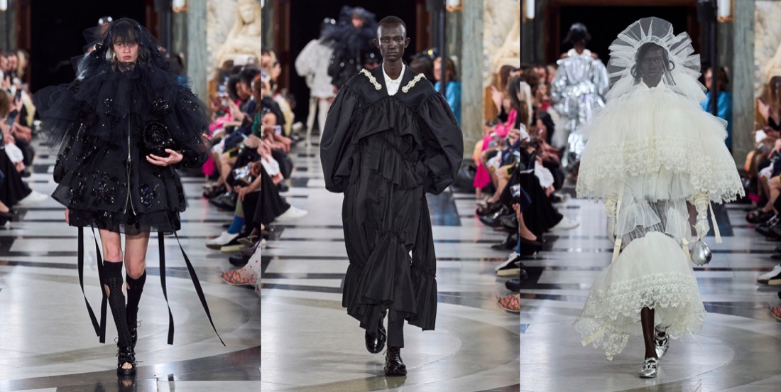
Simone Rocha‘s collections are never just “pretty” or just “feminine“. There’s always an underlying, slightly dark, raw energy behind them. “This collection was very much a reaction to the last few years. It was very much harnessing an emotion that felt like this kind of powerful, feminine statement.” Her harnessing literally went into the parachute tapes threaded through dresses and big, bubble-bomber jackets. She demonstrated how the tapes can function to change the shapes of garments – making something long or short, or giving it a different volume, according to mood. There were lots and lots of airy, pale white-beige-pink layers of tulle, what looked like a pink wallpaper print of flower-wreaths contrasted with a punkier strand of army green, tough aviator pants, and deconstructed corsets. And then, there were veils. Rocha has used veils powerfully before, more in contexts that have hinted at weddings and christenings – echoes of her upbringing in Catholic Ireland. Now, they were flounced, tiered constructs covering the heads and shoulders of women and men. There was a strange coincidence of fate in that. Considering what to do as she was absorbing news of the death of the Queen, Rocha was afraid that the audience might take the reference as a last-minute reaction; but in fact they were part of her own creative origin story; part of her instinct for going back to reconnect herself with the forces she’d been channeling as a student – a rebel girl beginning to grapple with her attraction to history. “There’s definitely pieces within the collection that I think people will feel potentially a response to the current situation. Because my original inspiration, back at Central Saint Martins, was this old tradition of the people of the Aran Isles, where women would dye their petticoats red and wear them on their heads in a funeral procession. I almost took them out at one point. It was touch and go. Then I thought no; because to me they represent this idea of ceremony, but also the vulnerability of it.” She’d also recalled them because she was starting with menswear (yes, finally!) – throwing the veil over the head of a boy was an early gesture in her process. “I wanted to work into this beautiful masculinity, and really think about the juxtaposition to everything I’ve done within the last decade with women, and see how that world plays out in the crossover between the two.” The dynamic had men wearing fragments of petticoats, styled with utility pieces and black tailoring. As Rocha found, creative ideas can’t be contained; she let a sense of the toughness flow over into her womenswear. With great, and emotional, effect. That’s what brought the audience to its feet. “I think clothes are sometimes an escape and a release,” Rocha reflected. “ And then I think I think they’re the reality. What can they be in that reality? For me, it was about making something protective, and healing, and an urgent sense of wanting to go forward.”
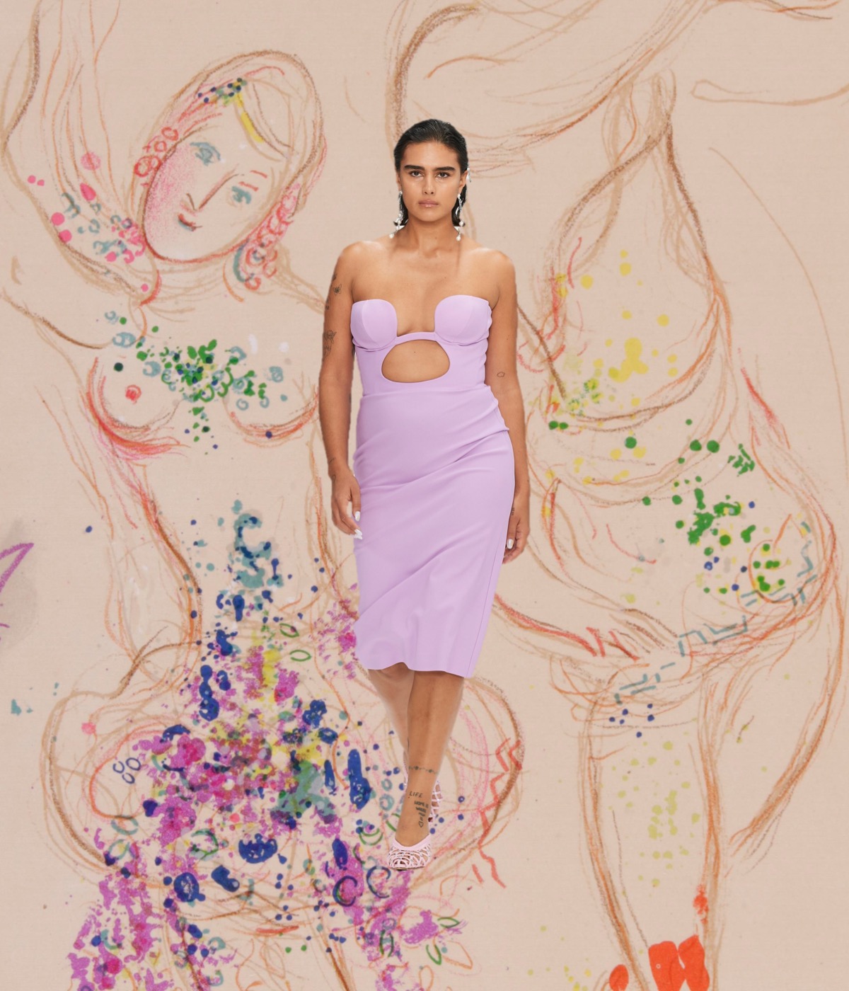
Collage by Edward Kanarecki.
Don’t forget to follow Design & Culture by Ed on Instagram!