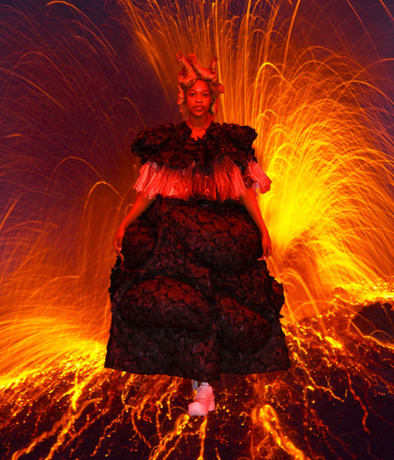
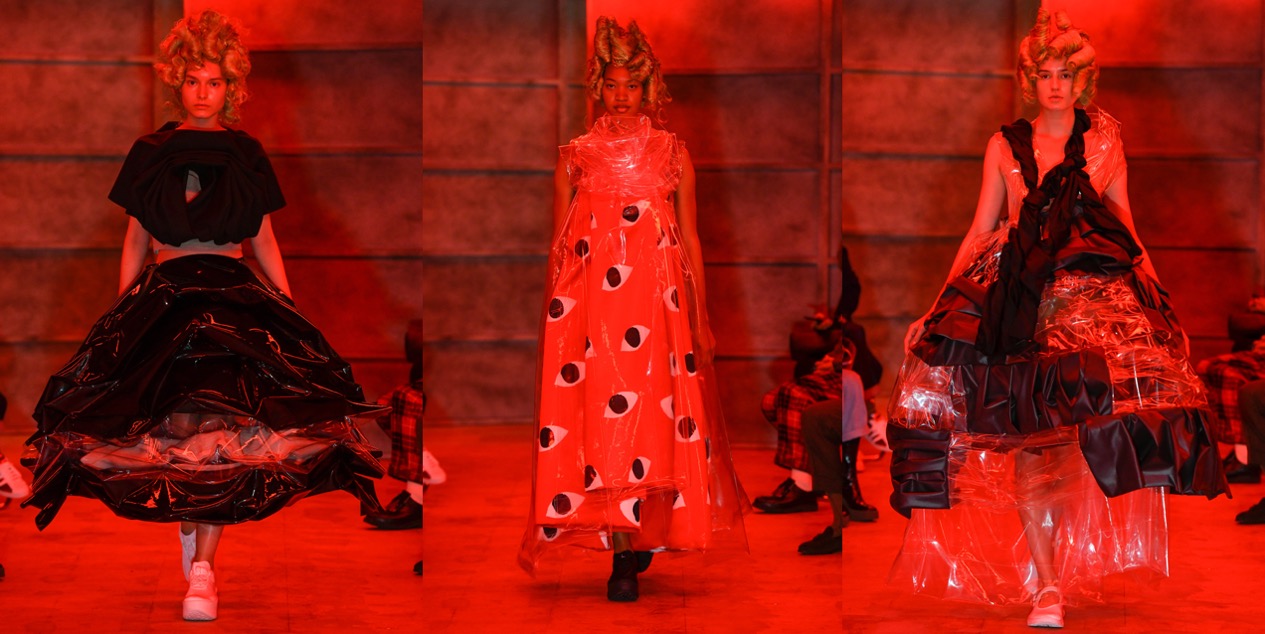
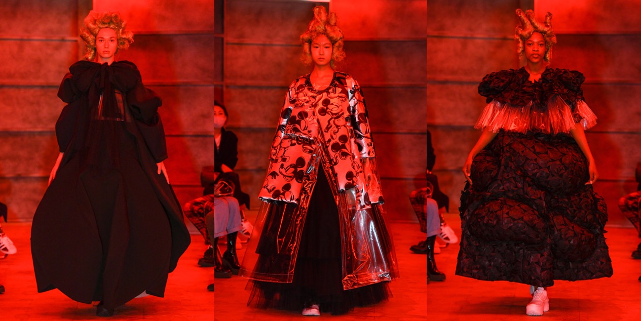
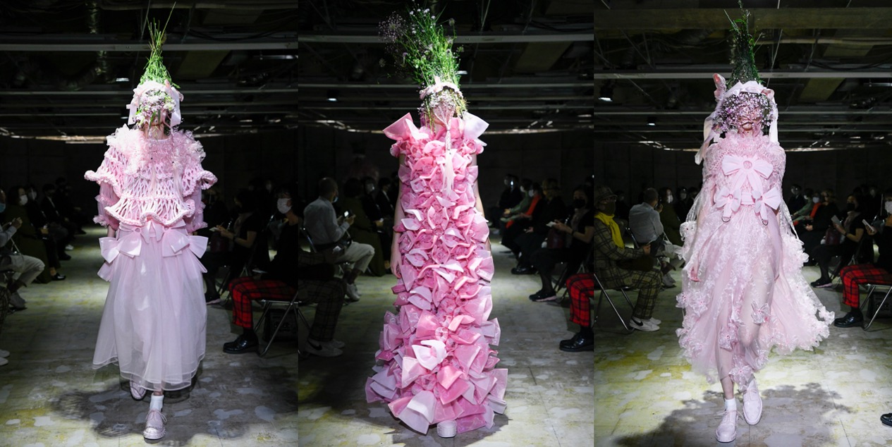
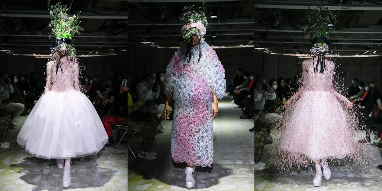
Extraordinary – that’s how one might describe Noir Kei Ninomiya’s garments. Most of them are sew-free constructions – he prefers rivets, snaps, or grommets – and for spring-summer 2021, we’ve got a series of handmade hyper-extravagant dresses, all of which would be perfect for a Björk album cover or a Nick Knight shoot. While Ninomiya usually stays close to his favourite palette of black, here we’ve got a deslightful splash of bubble-gum pink. Is this a sign of hope for a troubled world? The designer leaves it to your interpretation. Grandiosely modern silhouettes were delineated in materials that included wire, pearls, PVC, chain, a symphony of polyester fabrications, ribbon, satin, cotton, wool, three types of leather, and taffeta, with which the amazing aura-haze of the last look was constructed. Note the four varieties of this-season’s collaboration with the Prada-owned English shoemaker Church’s. These florally studded footwear options are the most straightforward way, along with his biker jackets, to buy into the Ninomiya aesthetic. Love!


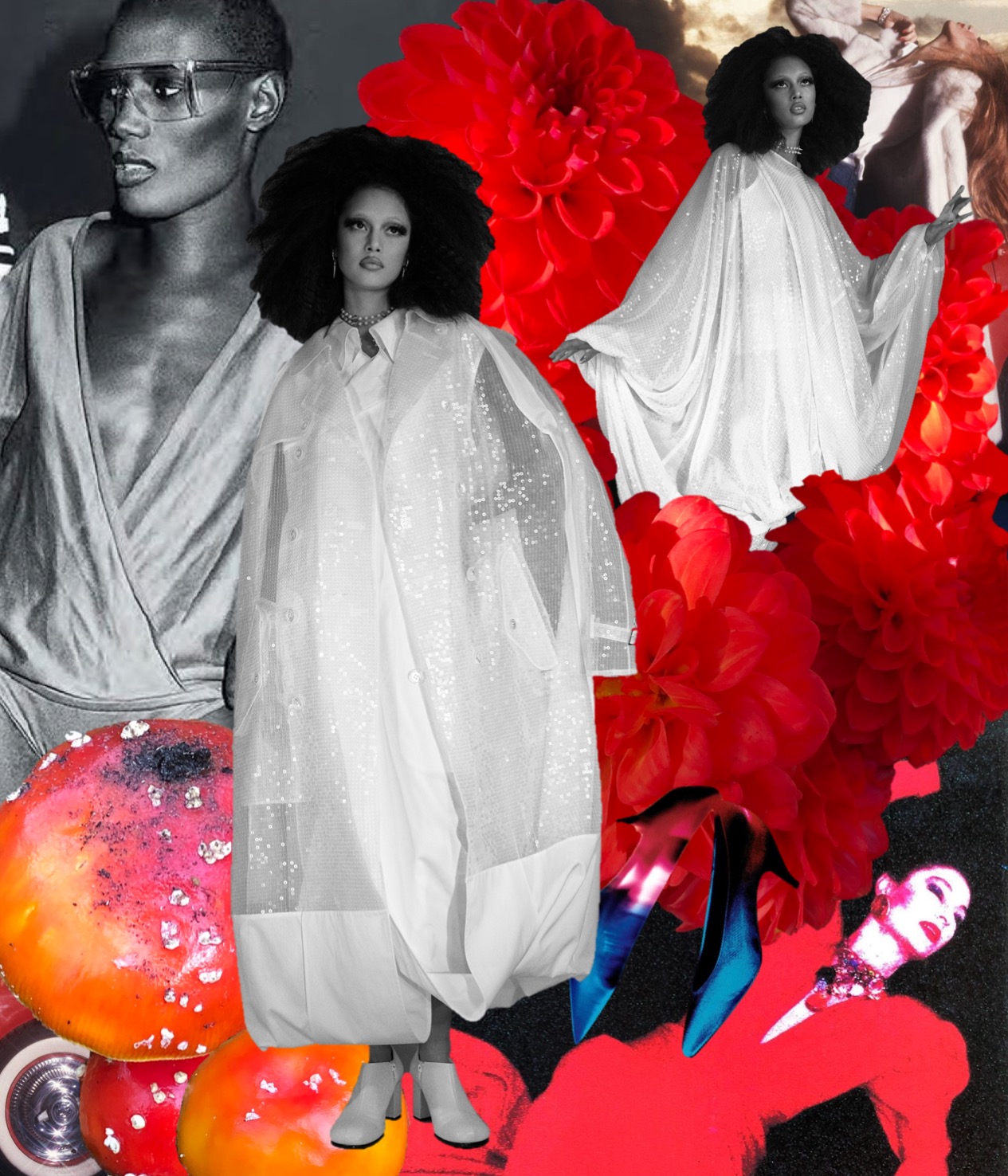
Collage by Edward Kanarecki.