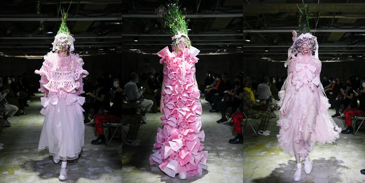
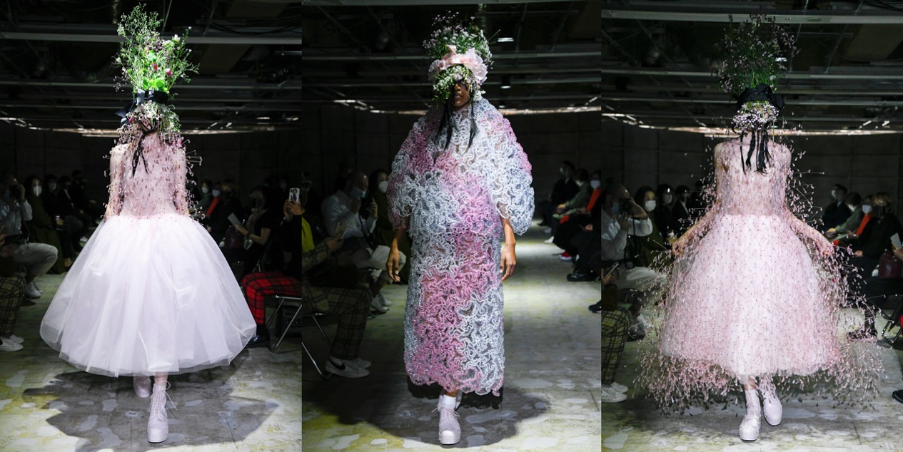
Think Pink. Noir Kei Ninomiya SS21

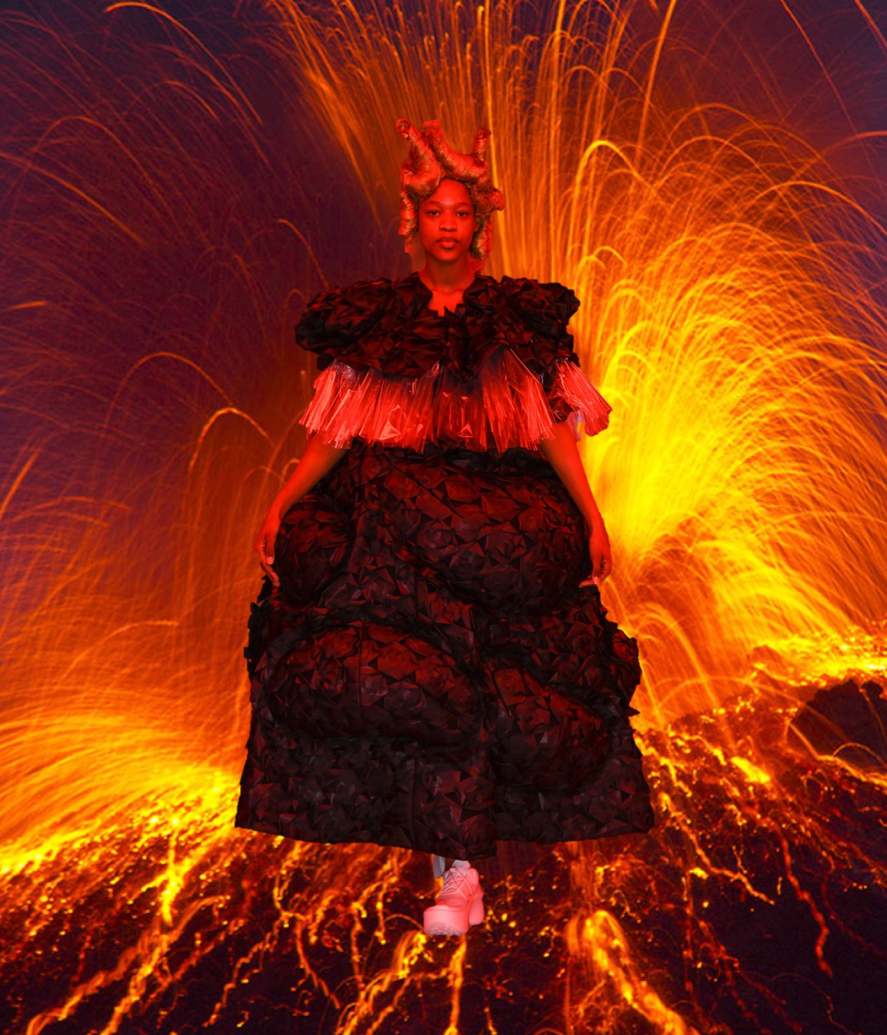
Extraordinary – that’s how one might describe Noir Kei Ninomiya’s garments. Most of them are sew-free constructions – he prefers rivets, snaps, or grommets – and for spring-summer 2021, we’ve got a series of handmade hyper-extravagant dresses, all of which would be perfect for a Björk album cover or a Nick Knight shoot. While Ninomiya usually stays close to his favourite palette of black, here we’ve got a deslightful splash of bubble-gum pink. Is this a sign of hope for a troubled world? The designer leaves it to your interpretation. Grandiosely modern silhouettes were delineated in materials that included wire, pearls, PVC, chain, a symphony of polyester fabrications, ribbon, satin, cotton, wool, three types of leather, and taffeta, with which the amazing aura-haze of the last look was constructed. Note the four varieties of this-season’s collaboration with the Prada-owned English shoemaker Church’s. These florally studded footwear options are the most straightforward way, along with his biker jackets, to buy into the Ninomiya aesthetic. Love!

Collage by Edward Kanarecki.

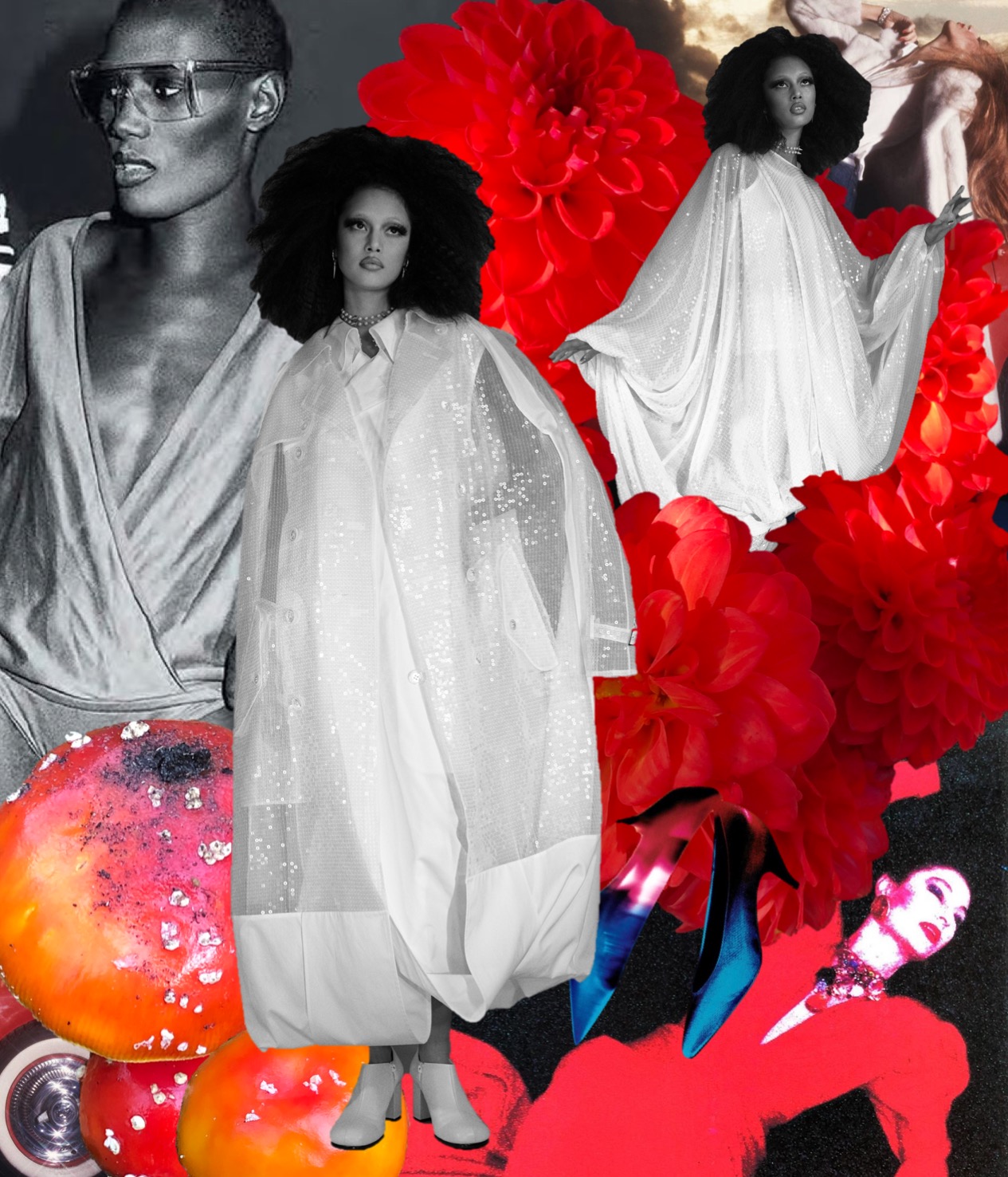
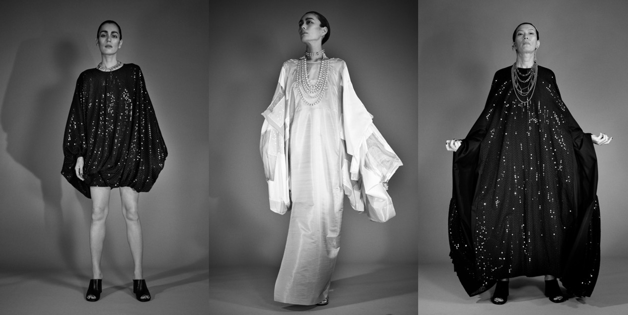
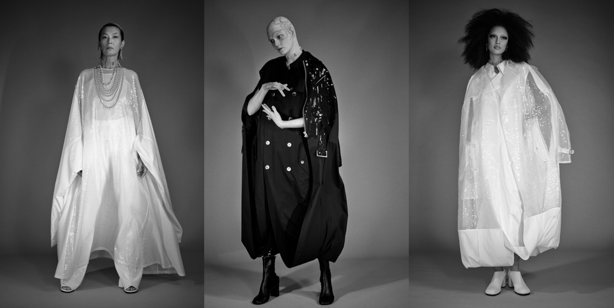
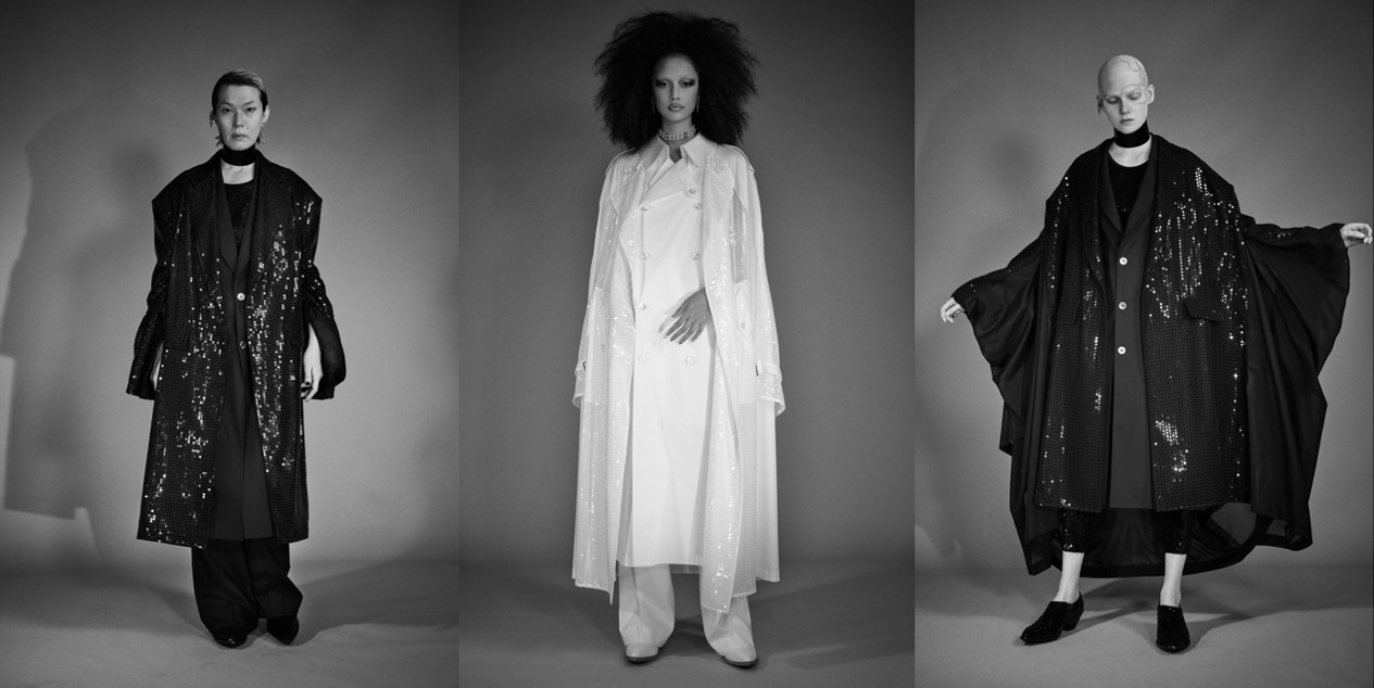
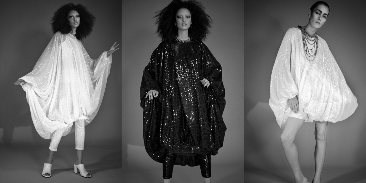
Disco Noir. Junya Watanabe SS21

Disco is having a rebirth in music – just think of Jessie Ware, Róisín Murphy or Dua Lipa’s latest records. During lockdown, we’ve all dreamed of a care-free party, so no wonder why some designers chose this escapist, joyful theme for the spring-summer 2021 collections.  Discussing his latest outing, Junya Watanabe’s press notes said, “It is a collection that reproduces the costumes worn by the stars in my memories. My memories are monochrome, and I created a photo session with four fictional stars.” The black and white images feature an assortment of apparently black or white looks, plus one or two more in silver. Nearly all of them are sparkling with sequins dresses that get the party started. The 1960s A-line gowns that close the look book, but also the trenchcoats that are integral to Watanabe’s oeuvre, have a disco noir feeling about them. Last season Watanabe paid punkish tribute to Debbie Harry. Though the Spangles may owe a debt to the Supremes, these muses are more abstract. In its spotlighting of sequins, the collection feels of a piece with earlier Watanabe shows that had singular focal points of their own, like army fatigues and puffers. His new season clothes have an easy-to-wear aspect that many have keyed into in this COVID year. I’s a whole lot of caftan-like shapes and leggings, essentially and a stripped-down outing by house standards. The most complex shapes were the coats whose hems looped up, creating generous volumes. But in tricking everything out in spangles Watanabe turned the concept of #WFH-wear on its head. Comfort, he gets. Hibernation? Not so much. Sequins are associated with happier times. If and when the world opens up, Watanabe’s women will be ready to loose themselves on the dancefloor.

Collage by Edward Kanarecki.

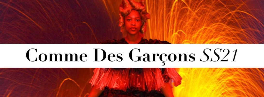
Dissonance. Comme Des Garçons SS21

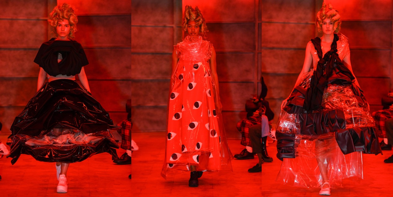
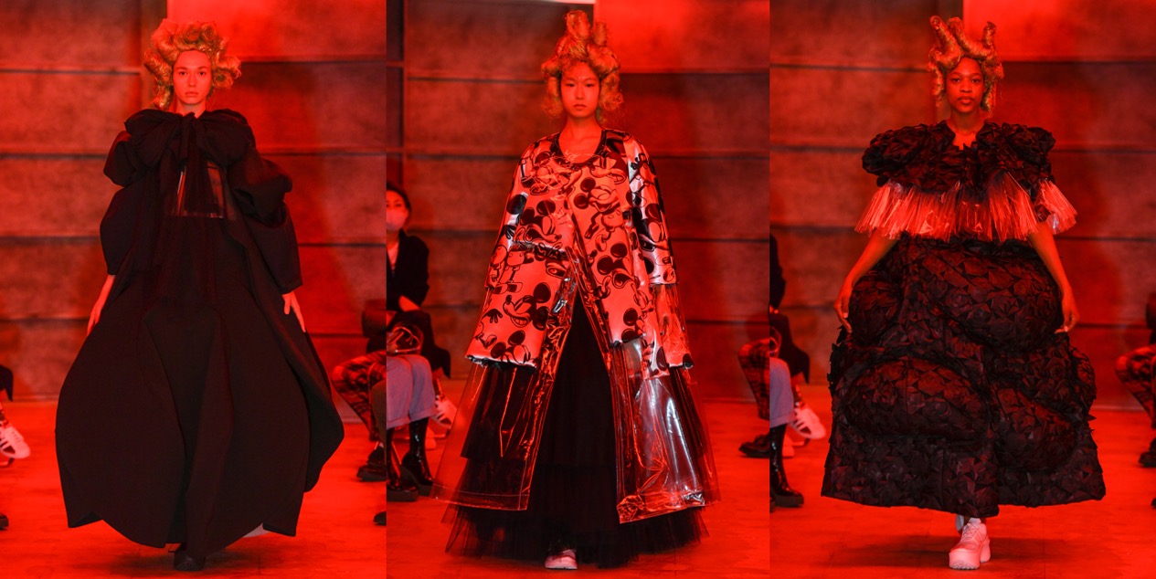
Paris Fashion Week felt incomplete without the Japanese avant-garde. From Tokyo, where all the Comme des Garçons family of designers have been showing, an email suggested that Rei Kawakubo has been striving to arrive at a creative resolution for designing in the midst of the existential plight that we’re all suffering. Dissonance was her theme: “The human brain always looks for harmony and logic. When logic is denied, when there is dissonance a powerful moment is created which leads you to feel an inner turmoil and tension that can lead to finding positive change and progress.” Any note of hope is gratefully received in these times of chaos. Discerned through the red light of her set – surely a signifier of the hellish state of the world, which at the same time made it hard to look at the garments in detail – her prescription for survival seemed threaded through with a playful, ironic sense of humor. Voluminous shapes, crinolines, bubbles, cloaks, and trapezoid coats came covered in plastic film. Then, what was Kawakubo up to, playing with Mickey Mouse and the Japanese Bearbrick teddy bear toy? Cutely reassuring representations of childhood innocence to cling to in our times of trouble, perhaps. The designer even messed around with the CdG heart logo, designed by Filip Pagowski back in the 1980s. The thing about Kawakubo is that her work brilliantly captures so many dissonant ideas at the same time. A phrase in her notes said she was interested in disrupting “the spirit of couture” with “illogical combinations and juxtapositions.” You sense she likes both the romance and glitter of couture and being punk with it, though – and this time, it almost felt like she’d had fun with it.

Collage by Edward Kanarecki.

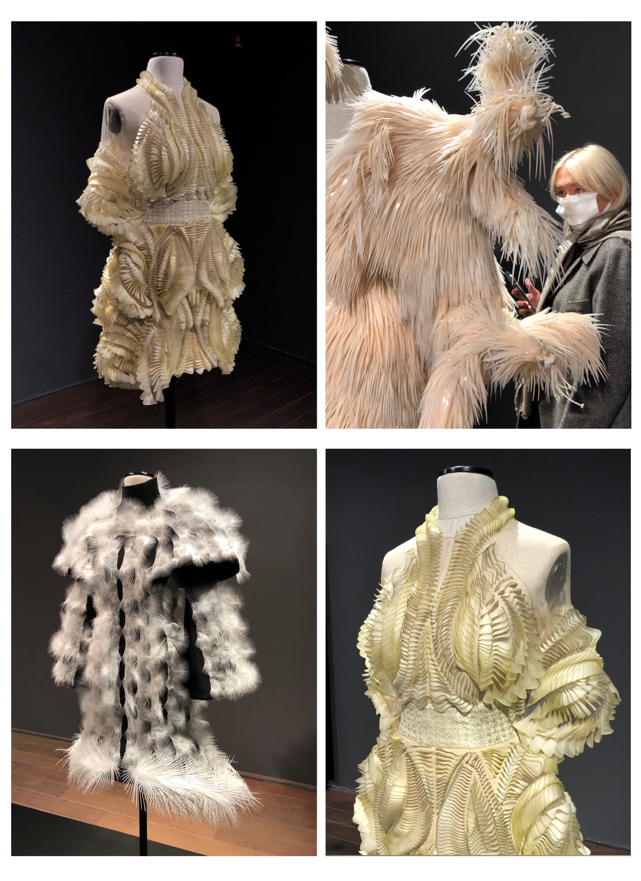
Iris Van Herpen in Poznan

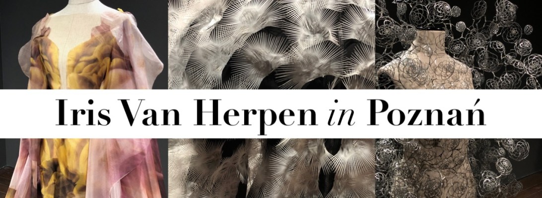
This might sound truly surreal, but yes, an exhibition dedicated to Iris Van Herpen‘s sci-fi creations has opened in my hometown, Poznań. “Alchemic Couture” is on show until the end of January in Stary Browar’s Art Station Gallery and presents some of the most striking designs coming straight from Van Herpen’s studio in Amsterdam. This exhibition shows how Iris van Herpen perceives haute couture as a transformative language, an interdisciplinary entity that emerges from the space in which innovation and craftsmanship interlace. The Iris van Herpen maison was founded in 2007 and showcases its collections bi-annually at Paris Haute Couture Week as a member of the Fédération de la Haute Couture. The brand stands for slow fashion with a multi-disciplinary approach towards collaborations with artists, architects and scientists. Each collection is a quest to venture beyond today’s definition of a garment, exploring new forms of femininity for a more meaningful, diverse and conscious fashion for the future. Organic, innovative femininity is expressed through state-of-the-art couture that embraces individuality powerfully and fearlessly. Van Herpen’s work is deeply rooted within nature – water, air and earth are elements that leave traces in the sensorial garments. The infinite properties alluding to movement such as the unbound forces and fluidity behind water or its crystalline formations are facets that flow into the designs. Through biomimicry, the maison visualises and materialises the invisible forces that shape our world, perpetuating a deep sense of organic presence. Captivated by architecture and how we embody space and inhabit sculpture, Van Herpen recognises both fashion and architecture as expressions of self, culture and community that link to the times and fabric of society. Changes of perception provoked through dichotomies between the hard and soft, structure and movement encompass the poetics of the brand’s craft. Transcending boundaries within the industry by liberating our sense of limitations, the maison is known for binding emerging technologies like elaborate 3-D printing or laser-cutting with delicate handwork such as embroidering or draping, creating a hybrid of haute couture. ‘Craftolution’, coined as the evolution of craftsmanship and the embracement of change form the core of the brand’s identity, fusing layered lightness, three-dimensionality, and undulating volume into ethereal creations. Summing up, seeing those works IRL is a mind-blowing experience.

Photos by Edward Kanarecki.

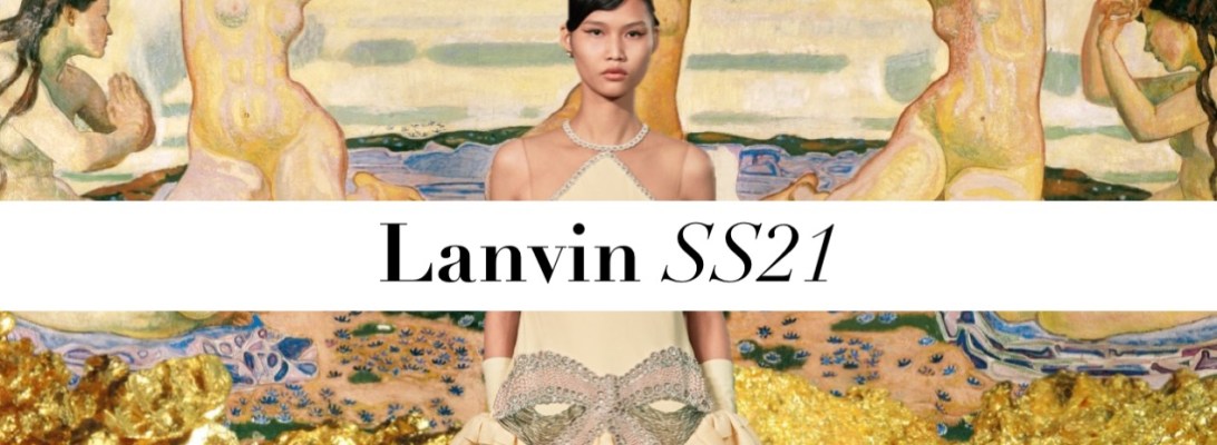
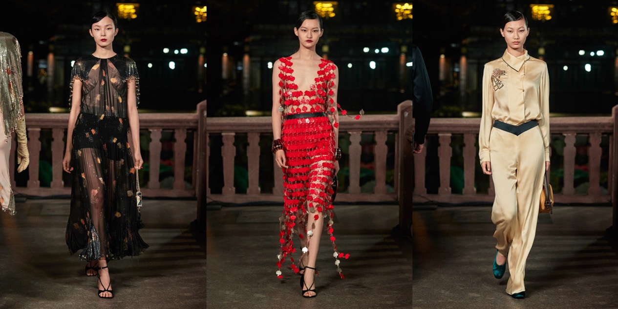
Jeanne in Shanghai. Lanvin SS21

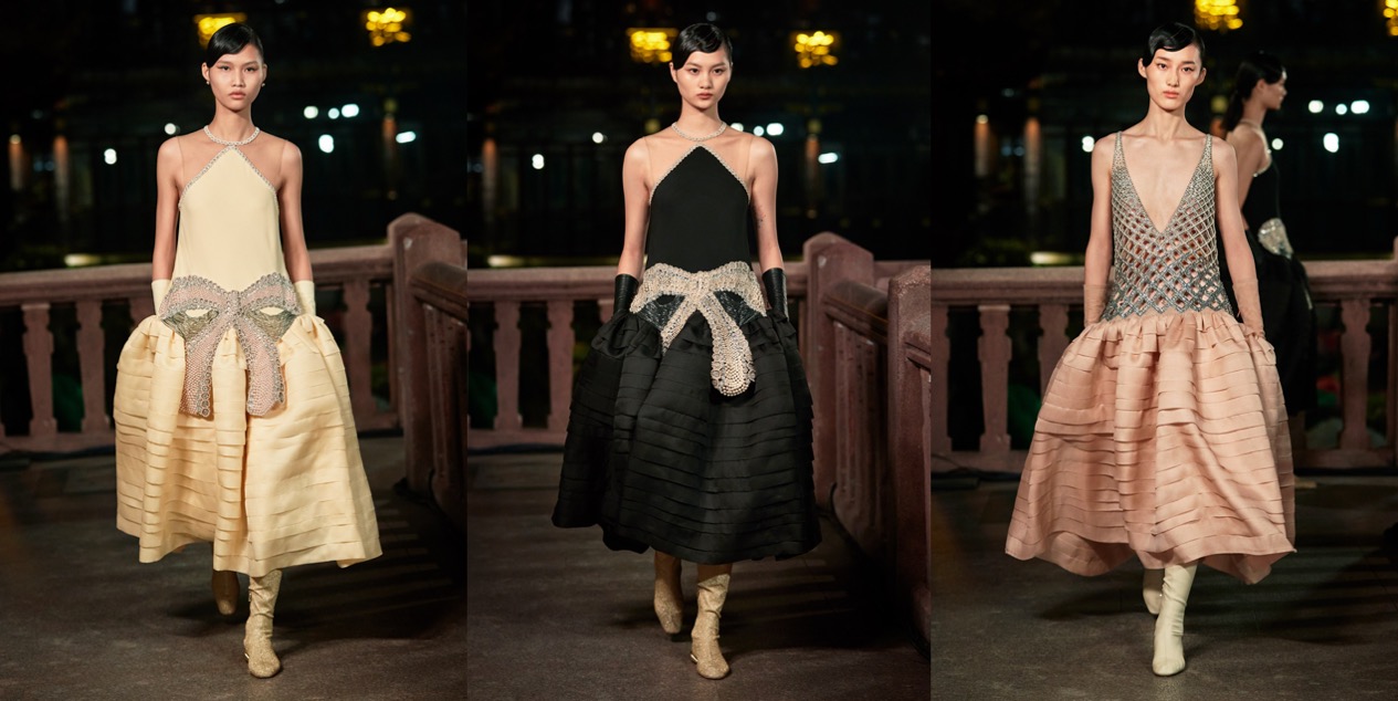
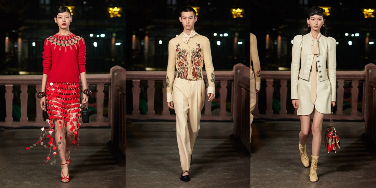
Is Lanvin‘s choice of showing it’s spring-summer 2021 collection in Shanghai a surprise? Not really. It’s financially and commercially a wise thing to do. Lanvin is owned by Fosun International, the Chinese conglomerate with such eclectic subsidiaries as the Wolverhampton Wanderers and Cirque du Soleil. Also, as far as fashion is concerned, there’s beautiful irony to the fact that China was the first country to return to a sense of normalcy after the coronavirus outbreak. Pre-pandemic, China was the new shopping center of the world. Post-pandemic, staging your fashion show there is pretty much a win-win scenario. “We can do a proper event there with hundreds of people,” Bruno Sialelli, Lanvin’s creative director, said during a preview in Paris, two weeks before he shipped his pre-styled Lanvin show to Shanghai and live-streamed it from the historic Yu Garden. “And to be very pragmatic, this is the market that is going to drive growth in luxury in general. It’s good for us to federate our community there.” What about the collection? The designer seems to be leaving behind his Loewe style and induldges in Jeanne Lanvin’s rich, Art Deco heritage. The opening looks were sublime: from those golden trinkets to the reimagined Jean Dunand motifs that graced garments and accessories, and the Armand-Albert Rateau pieces and Georges Lepape illustrations that inspired them. The show started with Sialelli’s interpretations of Lanvin’s robe de style, the dainty drop-waist silhouette she loosely revived from the 19th century. The first – black with a crystal bow across the hip – was virtually a replica of its 1920s embodiment. Somehow, it looks relevant in 2020. “Lanvin was at its strongest in between the World Wars. It became a huge company with hundreds of employees, ateliers, cosmetics, and everything. It’s interesting to observe the pendants between the 1920s and the 2020s,” Sialelli reflected. “Art Deco’s three words were order, geometry, and color. I think it expresses something that’s interesting to re-contextualize today.” Discussing his silhouettes, he mentioned “a certain rigidity,” explaining, “from the beginning, I’ve thought about characters like Maggie Cheung or Anna May Wong, who have this put-together attitude; very neat. I want to translate that character.” The collection has its ups and downs (the daywear felt whatever…), but finally, the new Lanvin takes shape.

Collage by Edward Kanarecki.