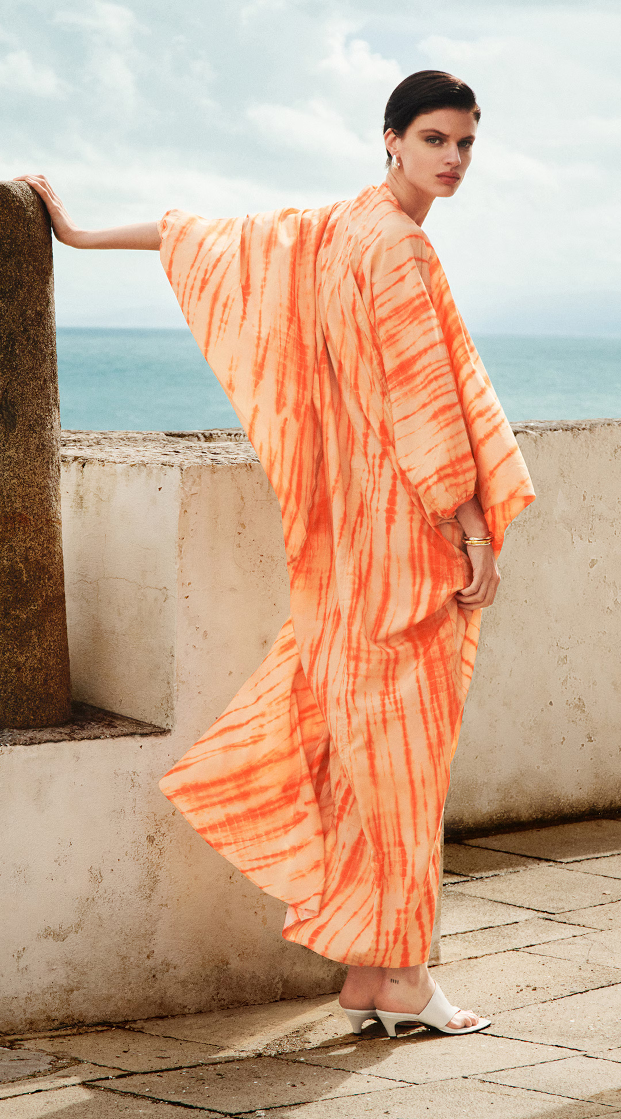
COS really nailed it with their new capsule collaboration by celebrating the art of shibori – and giving long-deserved recognition to Kazuki Tabata and his traditional workshop. Shibori, the Japanese term meaning to squeeze or wring, originates from the simple practice of resist-dyeing to create a mesmerizing array of colors, designs and patterns.
Emerging in Japan during the 8th century, its popularity grew exponentially in the city of Kyoto, in the country’s largest island of Honshu, where clean water and large surrounding rivers are said to have inspired many of its residents to start local shibori workshops. Centuries later, that includes Mr Kazuki Tabata, who prides himself on practicing Kyoto’s distinctive hand-dyeing methods through his maison, Tabata Shibori.

A former salary man specializing in sound engineering, Kazuki began his career in shibori after the passing of his uncle who worked in the family business as a traditional craftsman, which the Ministry of Economy, Trade and Industry certifies after at least 12 years of experience and succeeding written and practical exams. Kazuki, meanwhile, self-taught using the dyeing tools that were nearly thrown away, applying the technical skills of his formative studies in sound and lighting, its disciplines and aspects of collaboration, to inform his shibori creations. The artisan describes the compatibility between shibori dyeing and fabric as ‘necessary’, often favoring fibers such as cotton, linen and silk with character and depths best suited for effective dye penetration. Distinguished by the patterns or forms created from tying fabric, Kazuki specializes in methods such as kasa maki shibori, which resembles a wrapped umbrella, boshi shibori, resembling a hat, yukihana shibori, resembling snowflakes, and a unique technique known as tako boshi shibori, where the tied shape resembles an octopus. The dyes draw from traditional Japanese colours and hues found in nature throughout the four seasons.
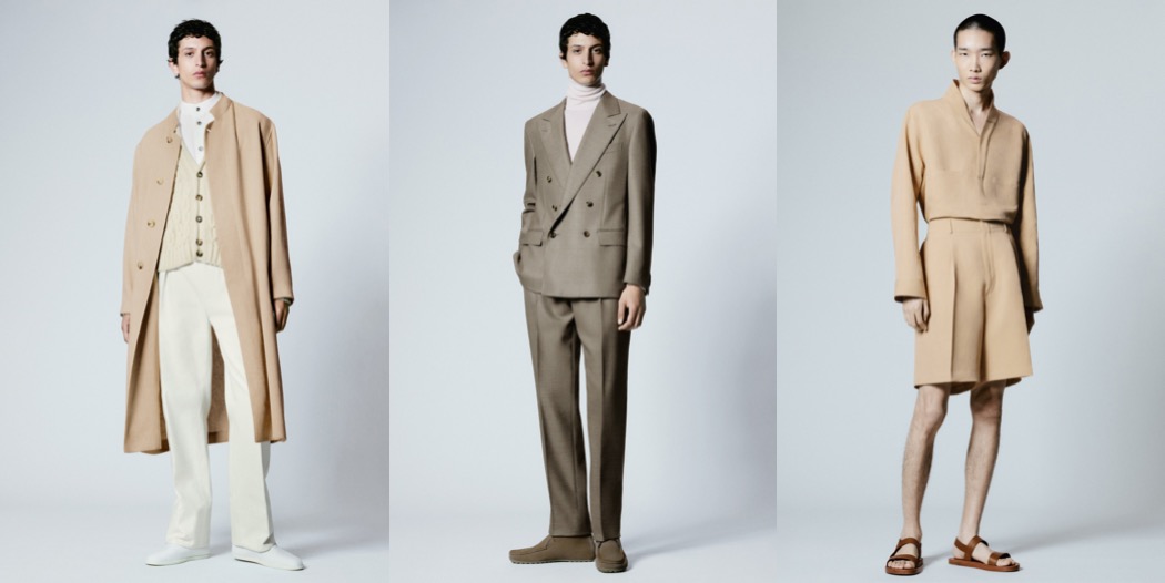
Through this collaboration, the London-based brand and the artisan workshop co-created summer-perfect pieces for women and men that showcase exceptional craftsmanship while reflecting the rich cultural heritage and innovative spirit of Japan. The collection is available starting today!
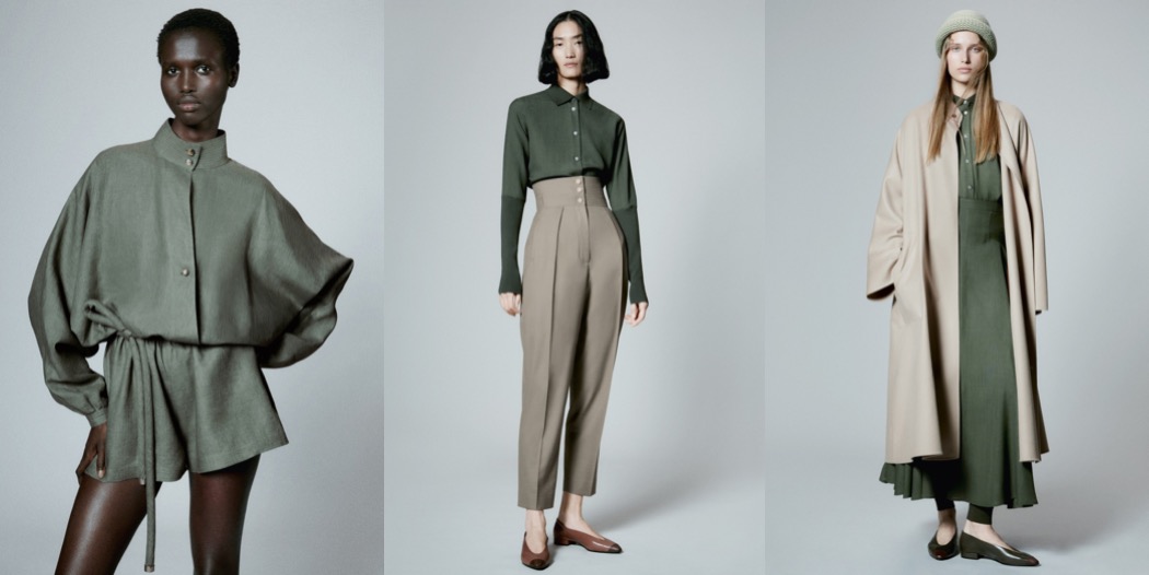
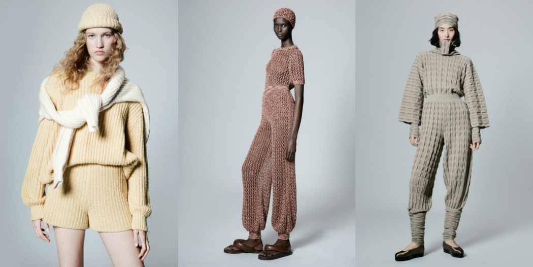
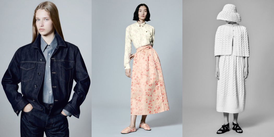
Here are my favorite pieces from the capsule which you can shop now…
ED’s DISPATCH:

Elasticated Wide-Leg Trousers in Beige


Longline Single-Breasted Blazer