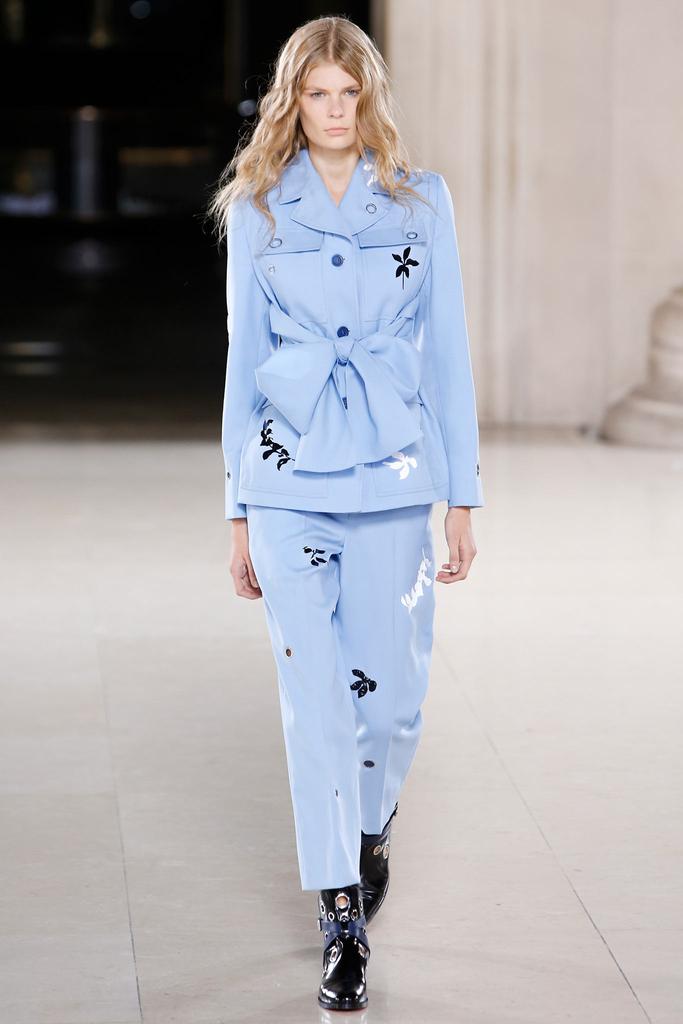
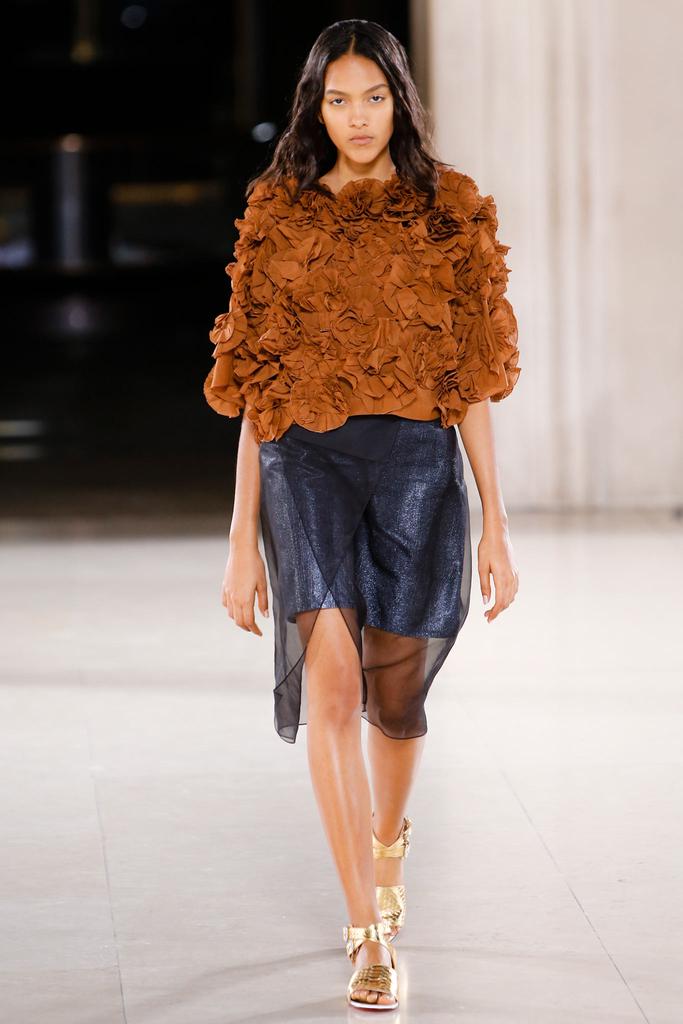
I like that, Jonathan! This season is possibly the most strong to date for this British designer. In his files, he’d come across a piece of cotton voile from a Japanese mill as light—and pliable—as paper. The possibility of combining the two inspired a striking effect: paper saturated with blue, impressed on fabric, like artisanal color-blocking. “It’s about process,” master printmaker Saunders explained. He wanted lightness. He got it.The show was really about beautiful lightness, ruffles and ribbons. This fragile yet very dynamic collection had also a beautiful shade of blue in it at the end. It felt elusive and fresh. And, in comparison with last season, it was much better!


