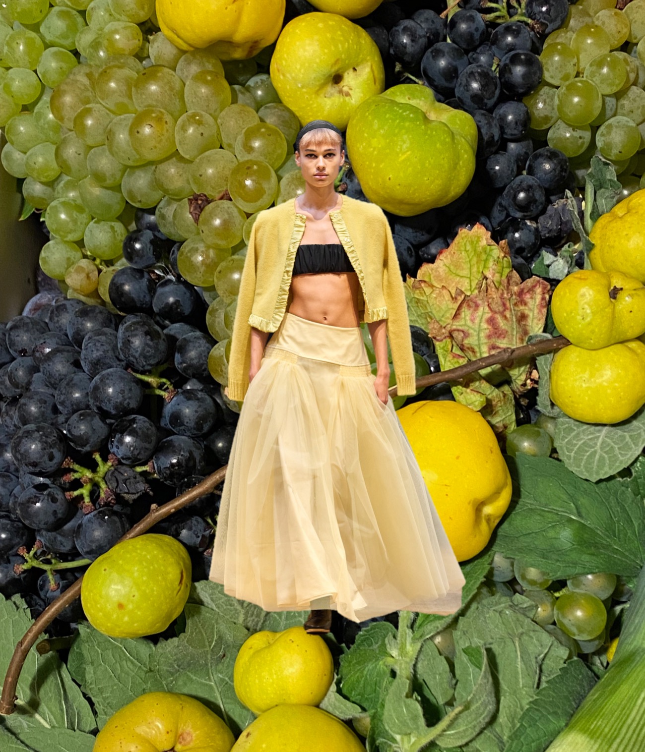
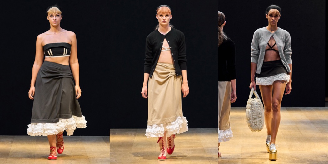
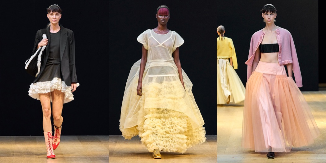
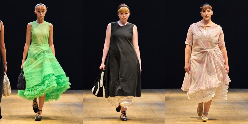
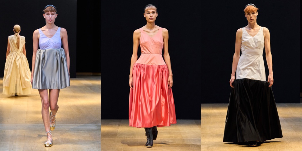
This season, Molly Goddard played with the notion of a “behind the scenes” moment: what’s happening behind the surface, or closed doors or… the clothes. The spring-summer 2024 show took place at Christie’s auction house on King Street, the other occasions upon which the designer would tend to visit were during the set up of displays. She elaborated: “When there are these masterpieces just lying on the floor: it’s kind of amazing to see and very exciting, which I guess in some way is connected to the collection.” Goddard fashioned a fair few masterpieces of her own in a lineup that focused on nudging the mechanics of garments to the surface, turning them inside out in order to create a patina of production. She said she’d done her research in the National Theatre Costume Hire, examining the stitched clockwork of garments ranging in style from Regency to contemporary. Long skirts were shirred at the hip to create drape down to edged froths of pale ruffled petticoat. The trademark tulle skirts were teamed with loosely corseted tops whose sheerness exposed the geography of boning and corsetry that defined their gentle geography. A dusty pink woolen cardigan was edged with a two-inch strip of satin, like some old granny blanket left bundled in the cupboard of a spare room. Washed out red rose prints used on more skirts and knitted into another cardigan – magenta paneled at the shoulder – added to the sense of comfortable, domestic nostalgia. A precise excavation of the deeply familiar but also overlooked, this was a quietly masterful collection. Said Goddard: “What I enjoy most is when I get really stuck in to how to make clothes; the techniques and the fabrics and the fit.” That pleasure in Goddard’s process was evident in its result.
Collage by Edward Kanarecki. Don’t forget to follow Design & Culture by Ed on Instagram! By the way, did you know that I’ve started a newsletter called Ed’s Dispatch? Click here to subscribe!
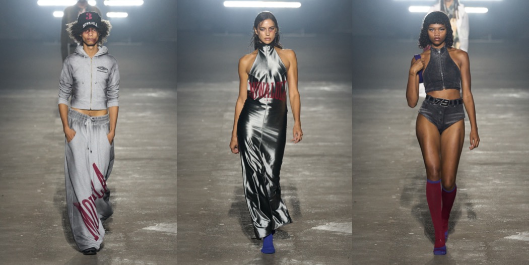
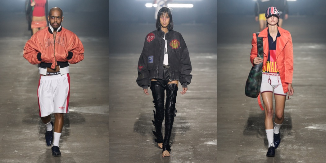
Mowalola Ogunlesi delivered a sharp start of London Fashion Week. Mowalola, the brand, is fast, furious, and at times obscene, but in a creatively vital way. Backstage of her spring-summer 2024 show, the designer, said the collection had been sparked by her first-ever viewing of David Cronenberg’s Crash. “I was really excited by the fetishization of pain through crashing,” she said. It prompted her to imagine “a whole universe that resides on the street,” filtered through a prism of ecstatic jeopardy. But Mowalola doesn’t stick to one reference. Masturbating anime girl prints; off-the-shoulder bombers with faux Highway Patrol patches; thigh-highs and micro skirts inspired by street walkers. A lot of stuff that Ogulensi’s customers will love. All that, like the excellent dirty denims, seemed to emanate a conceptual solar system adjacent to some of Glenn Martens’s work at Diesel. The pants that flashed cracks at the back and crotch hairlines were maybe subject to the influence of Alexander McQueen’s gravity. This was good company to keep: however the gartered, bisected pants and skirts, now a Mowalola signature, were all Ogunlesi’s own. The flags-of-the world theme was another highlight. This also ran into a poignant EU skirt meets Union Jack cap look. The extreme contrast of volumes in some sportswear looks made the generic appear particular.
Collage by Edward Kanarecki. Don’t forget to follow Design & Culture by Ed on Instagram! By the way, did you know that I’ve started a newsletter called Ed’s Dispatch? Click here to subscribe!
Back in July, I defended my MA Thesis in Art History titled “Selected Phenomena of Haute Couture Fashion as a Reception of Early Modern Catholic Pictorial Traditions”. In the thesis, I’ve analyzed one of the most intriguing examples of dialogues between fashion and Catholic imagery in history: Arkadius’ Finale Icon which closed his revelatory spring-summer 2002 collection. For the sake of research and a better understanding of the designer’s intentions, I’ve interviewed Arkadius himself at the beginning of the year. Yes, the legendary designer, the ultimate icon of Polish fashion, the creative who enamored London in the late 1990s and early 2000s.
First, here’s an excerpt from my thesis, where I discuss the designer’s take on Catholic imagination through Finale Icon, an incredible piece of fashion history:
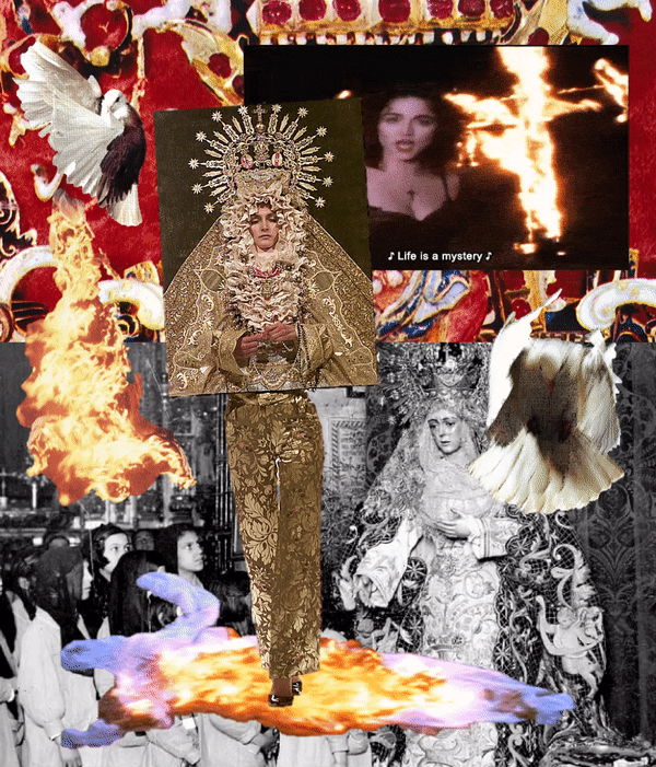
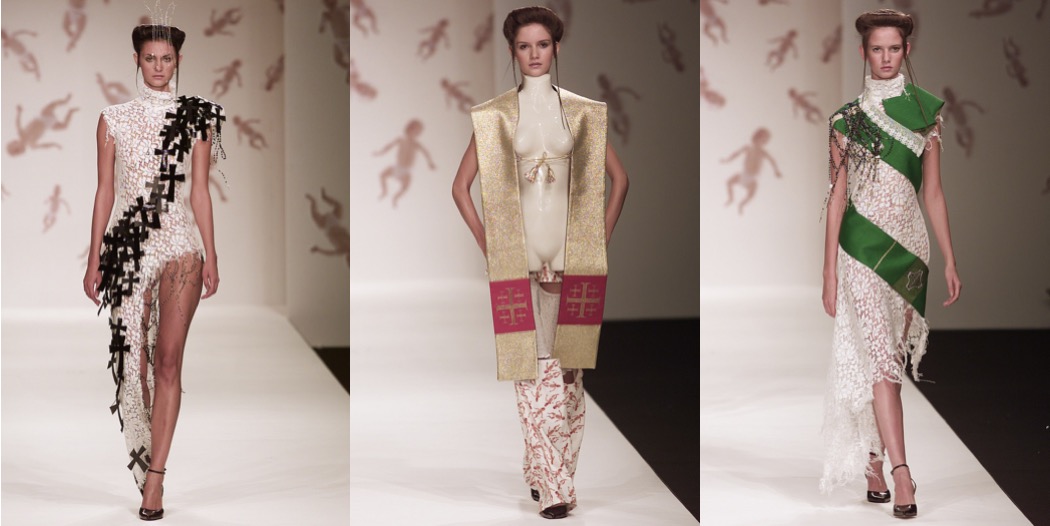
Arkadius’ design, which comes from the Virgin Mary Wears The Trousers collection, was inspired by two different artistic representations of Mary: the statue of the Blessed Virgin of Macarena from the Basilica De La Macarena in Seville and the painting of Our Lady of Czestochowa.
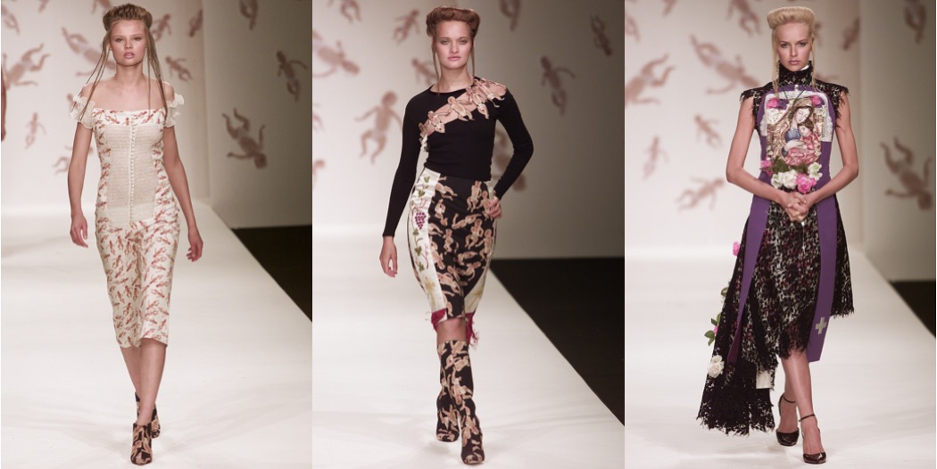
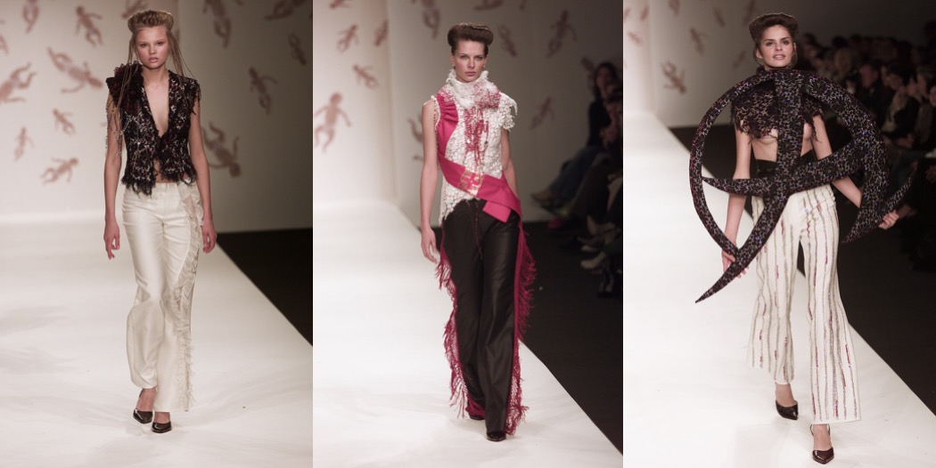
In his work, Arkadius drew inspiration from the world around him, from political events and social phenomena to art and literature. As with Cristóbal Balenciaga [another designer whose Catholicism-inspired work I’ve analyzed in my thesis], images of visual culture related to homeland were an important reference for him. An example of this is the spring-summer 2001 Paulinacollection, where Polish folklore and rural lifestyle proved to be the key references. Polishness as understood by Arkadius, consisting of a cultural landscape built from folk traditions (including Łowicki and Podlasie cut-outs and wicker decorations), was never seen before in such a bold way in the work of any contemporary fashion designer, let alone at London Fashion Week. It seems that the Paulina collection became a starting point for the further deconstruction of Polishness, and the creation of a collection related so intensely to a significant image of native visual culture that is Catholic tradition. In the designer’s own words, “the environment in which we grow up, the society in which we function and the religion we follow shape us in a certain way.” The Virgin Mary Wears The Trousers collection appeared to be a thorough reflection on the phenomenon of religion, which can unite as well as differentiate people.
The Polish designer presented looks inspired by liturgical vestments (such as a stole), treated rosaries as decorative trims on dresses, and used ecclesiastical motifs like the Latin cross, the heart-shaped ex-voto and the representation of the white dove in the form of ornate embroidery on jackets and tops. Arkadius “desacralized Catholic images and church ceremonial and transported and exploited their aesthetic qualities for the sake of fashion spectacle”, Dominik Zieliński stated in the designer’s monograph. What interests me most, however, is the final creation in the collection, which Vogue fashion critic Sarah Mower compared to an experience of “religious climax”.
The Finale Icon look largely escapes conventional identifications of garments. Presented on the catwalk by model Kasia Pysiak, the outfit consisted of two essential pieces of “clothing”. The upper part of the ensemble, worn over a black shirt, was a rectangular black canvas stretched over a frame with specially cut holes revealing the model’s face and her protruding hands. The lower part of the outfit was a pair of pants of classic cut covered in opulent, floral pattern. The runway styling was completed with black stilettos created in collaboration with Jimmy Choo Couture. The most important element of the look is the aforementioned canvas, which was modeled on the image of the Virgin Mary as well as on the tradition of decorative dresses placed on representations of Madonnas [a historical Byzantine-Ruthenian tradition]. This part of the ensemble, with its form resembling an icon and depicting on its surface the figure of the Madonna wearing a crown, was hand-finished with gold jacquard fabric, various lace and costume jewelry in the form of cabochons. It was a “controversial combination of the traditional sacred with the modern profane”, Zieliński concluded.
And now here’s the interview regarding Finale Icon – published for the first time here on Design & Culture by Ed!
Ed: Regarding the final look from the Virgin Mary Wears The Trousers show, what influences and inspirations from sacral art played a significant role for you? The book “Arkadius. Fashion That Became Art” mentions the inspiration coming from the Virgin Macarena of Seville. Why was this particular representation of the Virgin important to you? Did you treat that image of her in a “formal” way when creating this garment, or was it more of an initial impetus for the creative process?
Arkadius: The main reason for using the image of the Virgin Macarena of Seville was her global recognition as an iconic religious imagery. This particular image is an actual 3D sculpture and is very well known and a striking work of art, with a very deep sorrow look, tears, which capture the morbid spirit to represent the philosophy of this particular collection. The strength of the image and the entire mood of the collection was also beautifully captured by the model wearing it as the finale of this show.
Ed: Looking at the ensemble, I instantly associate it with “Our Lady of Czestochowa”, and especially with the “ritual” that is so characteristic of this artwork – that is, adorning it with the encrusted dresses. Did such inspiration take place in your creative process? Do you see any dialogue between the runway look, and this very work of art and the Byzantine-Ruthenian tradition associated with it?
Arkadius: Being Polish myself, my original idea was indeed to use the imagine of Matka Boska Częstochowska and not the Virgin Macarena of Seville, but I also knew that our Polish Matka Boska did not have the same global recognition as Macarena. The Finale Icon outfit was directly inspired by the opulence of Macarena figure, with all its intricate details of embroidery, gold and Byzantine richness. This richness is a metaphor of holiness in the Catholic religion, which very often puts more attention to the imagery rather than the spiritual connection as its religious representation.
Ed: The final look is literally related to the title of the collection. The model portrays the Virgin Mary “wearing the trousers” – that is, in a sense, occupying a stereotypically male stance/position. In my thesis, I am interested in the gender stereotypes, so deeply encoded in the Catholic imagination. Designers, through the medium of fashion, subvert them – for example, they create outfits inspired by the vestments of cardinals or bishops, strictly reserved for the male church hierarchy, and use them in women’s collections. Was criticism of the patriarchy one of the more important aspects regarding the creation of this look?
Arkadius: It is a very good question, thank you for this. I don’t think that anybody has ever asked me what was behind the title. This was actually nothing more and nothing less as a tongue-in- cheek or a whimsical exaggeration of our made-up story of who actually wore the trousers in the family. But this comparison also brought attention to a very fast changing family and gender structure and how many women are now actually running families and not men as it used to be in the past. Hence the idea of the title and the recognition of woman’s strength and her actual position in the society in the 21st century.
Ed: The entire ensemble, from the “icon” part to the trousers, is extremely tactile, rich in texture, opulent, like a real sculpture or painting depicting the Virgin Mary. Do the materials used in the creation of the outfit have an ecclesiastical origin or were they upcycled?
Arkadius: All the materials used in this outfit were recycled from already previously owned pieces of fabric. Only the frame of the icon was purchased new. The trousers fabric was bought by me in Grand Bazar in Istanbul, so it had a Byzantine origin. I bought it at the time because I liked it very much and it didn’t have a specific purpose at the time of my purchase. It became useful later on while creating this particular outfit. All the intricate details from the icon part, were used as cut outs from all sorts of other items we already had or had to find in charity shops.
I’m endlessly grateful to Arkadius for providing me with such valuable answers to my questions, and to our mutual friend Julia Strużycka for connecting us!
FYI: If you want to read my full MA Thesis (it’s in Polish) or are willing to publish it in an academic journal, please feel free to contact me at designadculturebyed@gmail.com!
Collage by Edward Kanarecki. Don’t forget to follow Design & Culture by Ed on Instagram! By the way, did you know that I’ve started a newsletter called Ed’s Dispatch? Click here to subscribe!
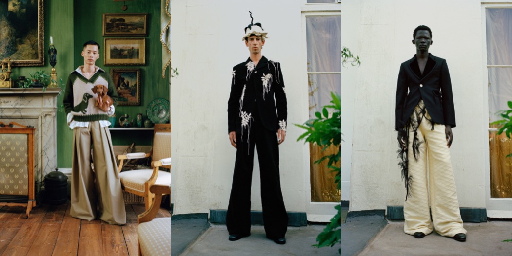
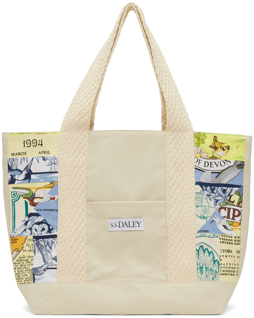
The theme of artist at home has sprung dozens of stories where a visionary creates a vividly alive environment that becomes not only their studio, but a “total artwork” (Germans have a term for it: Gesamtkunstwerk). History of art – especially the British one – has plenty of examples of such romances between creatives and their surroundings. Horace Walpole’s Strawberry Hill. Sir John Soane’s home-turned-museum. Vanessa Bell and Duncan Grant’s Charleston, which became a bucolic residency spot for the Bloomsbury Group. For his spring-summer 2024 collection, Steven Stokey-Daley centres around the duality of ceremony and practice, following the life and home of an artist. Harry Styles’ favourite designer began his research by studying the lives of British painters Lucien Freud and David Hockney in their working environments, taking a look back at British public school dress while examining the shifts in sexual identity in the early 1900s. All that sounds distinctly S.S. Daley. The new season offering is a neat continuation of Steven’s style vocabulary: clean-cut suiting is paired with pleated shorts, blooming hydrangea embroideries decorate striped workwear sets, oversized wool knits are canvases for charming dachshund puppies (Hockney’s favorite breed, as well as mine!) and ducks. Some of the shirts come in still life fruit bowl print, which reminisces the ever-evolving European artistic tradition. Multi-pocketed, waterproof coats are nonchalantly splashed with paint (you just always splatter your favorite clothes while painting!), echoing the collection’s idea of merging the domestic intimacy with the sacred act of creating and expressing your own, untamed, highly-personal thing.
And here’s a bunch of my favourite S.S. Daley items you can shop right now:
Collage by Edward Kanarecki. Don’t forget to follow Design & Culture by Ed on Instagram! By the way, did you know that I’ve started a newsletter called Ed’s Dispatch? Click here to subscribe!
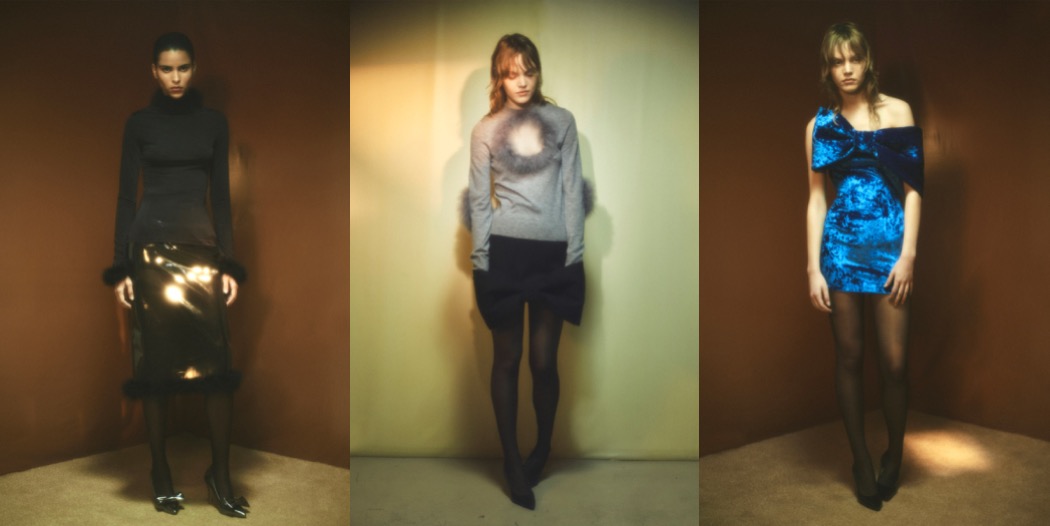
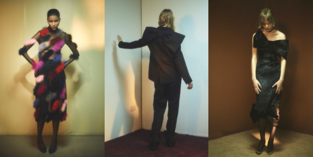
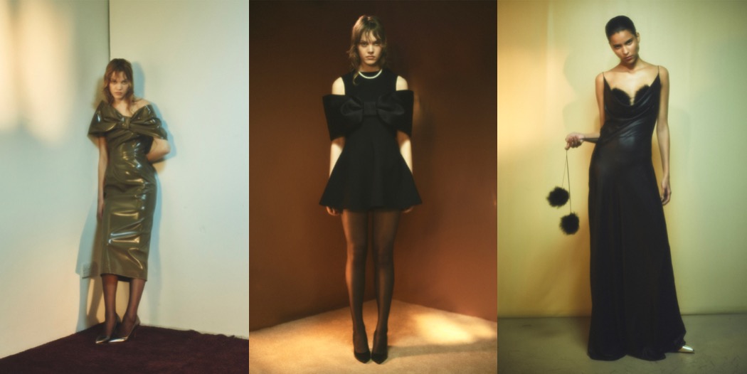
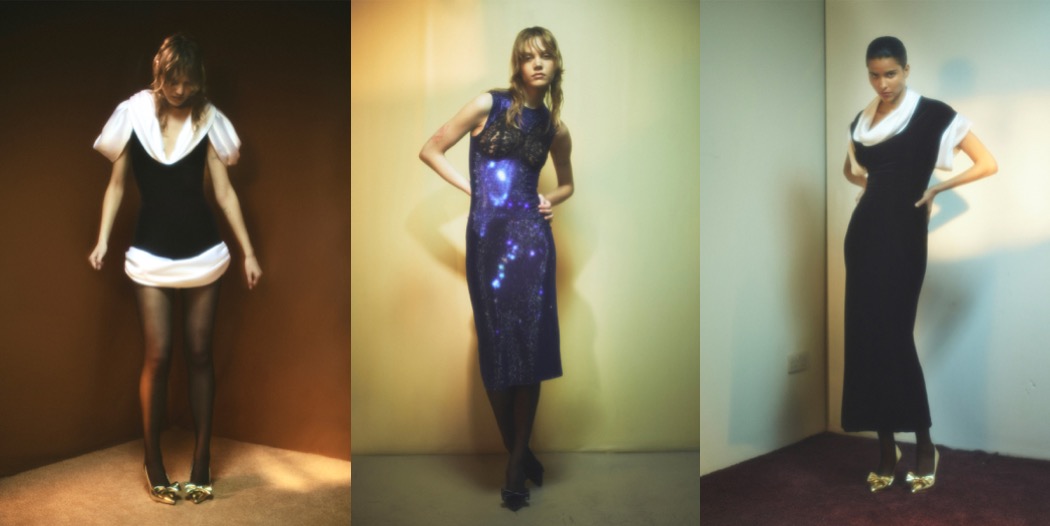
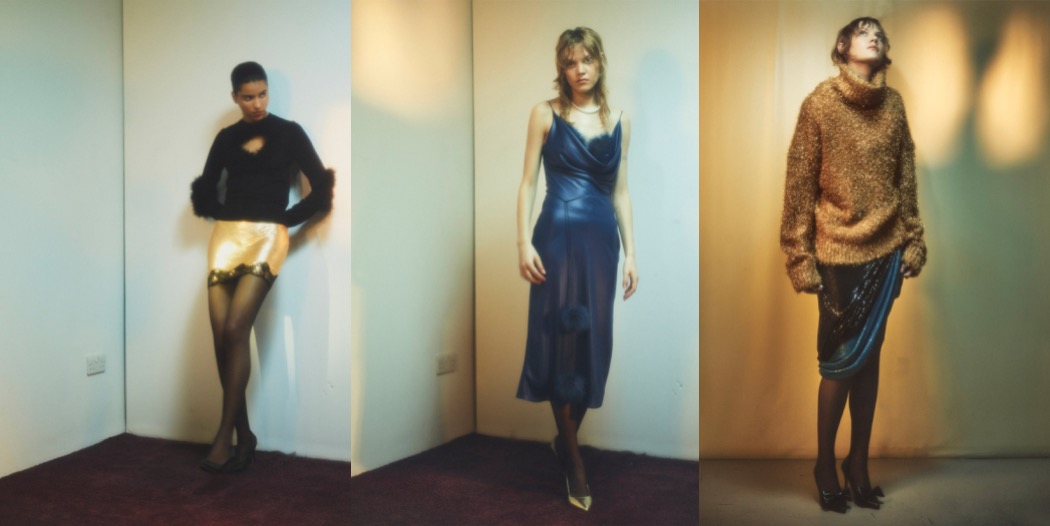
Yesterday’s news of Christopher Kane entering administration and considering selling his namesake label make you realize that in this industry, truly inventive creatives have to struggle, while others get unlimited budgets and press just… because. It’s no news that running an independent creative fashion label in London is practically impossible, but the vision of Kane exiting fashion is just heartbreaking. His knack for wickedly original, sometimes even disturbing pairings of strange materials and references has earned him a reputation of a playful conjurer who with grace combines non-obvious sexiness with contemporary chic. Hopefully, the designer will find a financial solution similar to Roland Mouret, another significant London-based designer, and will continue designing under his own name with new, supportive partners behind his back.
If resort 2024 is actually the last Christopher Kane collection we will ever see, then it’s exemplary of the designer’s unique fashion vocabulary. This line-up is packed with chic-funny-simple evening ideas that look like a joy to wear. Should you detect a ’50s/’80s post-punk New Wave-ish vibe coming off it, you’re not wrong. As ever, behind every brilliant Christopher Kane party-trick, there lies something darker. This time, Christopher and his sister, Tammy, had been watching All the Beauty and the Bloodshed, the documentary about Nan Goldin that weaves her groundbreaking ’70s and ’80s photography into footage of her campaign of protest against the Sackler family’s sponsorship of major museums and galleries (The Sacklers own Purdue Pharma, a pharmaceutical company whose main drug is the opioid Oxycontin). It struck them that the connection between the forces of super-wealth at one end of society, and the most deprived at the other were stingingly present – in the clothes. It was the sight of the cocktail dresses, lingerie, and scrappy gowns worn by Goldin’s penniless junkie LGBTQ friends that resonated. “The reason they looked so amazing in their poverty is that they were wearing second-hand and discarded clothes thrown out by the wealthy – couture, designer clothes from the ’40s and ’50s”. For them, that fit with their childhood and teenage memories of seeing the deprivation of communities in the post-industrial Glaswegian conurbation they grew up amongst. It took them back to remembering the glamour of the neatly-dressed barmaids serving in Working Men’s Clubs in the mid-to-late ’80s—another source for the sexy synthetic fitted dresses they conspired on in this collection. The subversive references they use aren’t at all visible, of course. What Kane always does is to turn the brew of associations into relevant fashion. Really, not many contemporary designers have that skill.
Collage by Edward Kanarecki. Don’t forget to follow Design & Culture by Ed on Instagram! By the way, did you know that I’ve started a newsletter called Ed’s Dispatch? Click here to subscribe!