 Prints are always the key element of every Altuzarra collection. Thanks to SSENSE.com, now we can explore deeeper the inspirations of Joseph Altuzarra’s magic skill of printing and embroidery in his amazing collections. Everytime he choses a colour or motive for his new print, Joseph’s mind is being influenced by travels and everyday life. It may be a jungle paradise, ethnic flower print or Nazca caligraphies. And here is a recap of Joseph’s biggest hits!
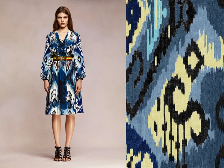 Resort 2013– Altuzarra explored culture of nomadic people, trekking into the heart of African Safari. The print that are used on the skirts, as he said, are inspired by Massai tribes. The colours were left as they are in reality- pigments of curulean blue, verillon red.
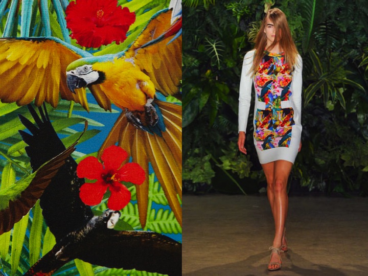 SS 2012– Joseph interprated the classic Hawaiian shirt and hulla skirt, and made it cool and very New York. The prints “contained” hibiscus flowers, parrots, liles and hyper strong colours. This paradise is very close to heart of designer because when he was a child he remembers the bird watching in California. And this is my favourite print of all!
 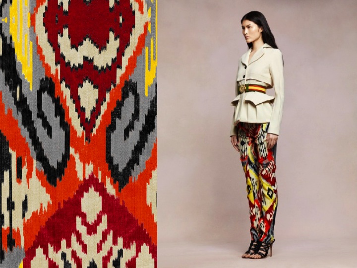 Resort 2013
 Fall 2012- Altuzarra took us to the souks of Marrakesh when creating his prints for winter. He revisted traditional motifs of Maroccan rugs, used jacquard and tribal luxury in the coats with fox fur. The fragile silk sweaters were meant to replicate… carpet effect. When I saw it for real (it was like yesterday… :D) it looked horrrible. And that was as for me the worst collection of this designer.
  Spring 2013- The 2013 Altuzarra Collection was like a plate of Indian curry mixed with duck’s foie gras. Definitely there was too much of everything. Butterflies, India, gendarmes outfits, orthopaedic leg braces… Yes leg braces! An I’m talking about these horrifying gladiator shoes with butterflies. They really look like they were inspired with orthopaedic legs, but with some “beautiful” ornament.Then we’ve the highly tailored jackets. They look, like if they were stolen from a wardrobe of a French gendarme. But only the colours are different and the Altuzarra ones are more stylish. And if we believe Altuzarra, the print was all about vintage jewellery- Altuzarra looked to the American naturalist art movement of the 1940’s to create this print for the SS13 season.

